Day 1: Easter Theme Week
Save 15% on all products in the Easter section
Hi Peeps! Debbie here for the Easter Theme Week at Pretty Pink Posh! Today, I’m playing with the adorable Easter Bucket Additions die set and many more new and previously released products!
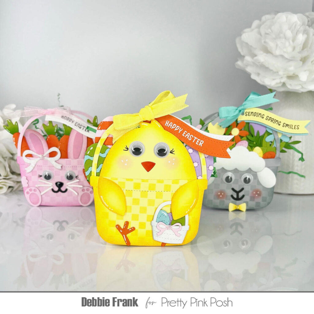
I was recently inspired by Tammy Stark’s flag and treat boxes. So, I decided why can’t the Candy Bucket Dies be used as a treat box as well! Not knowing that it would lead up to making all three of them!
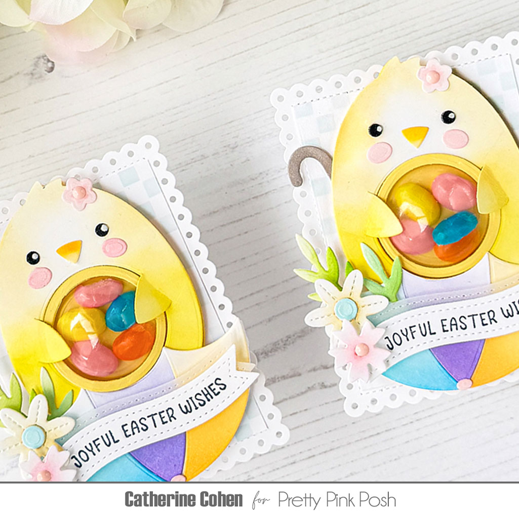
For my first Candy Bucket Treat Box I went with the pink bunny!
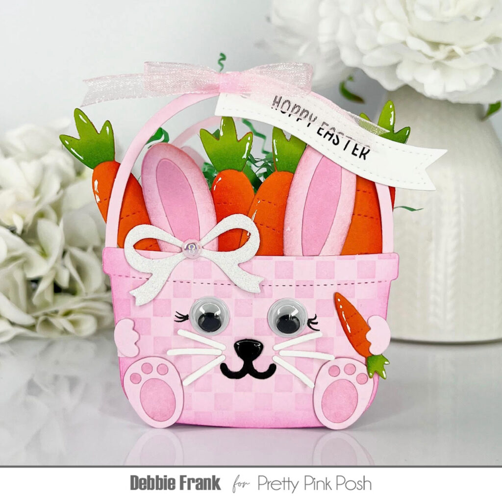
I started off making the Candy Bucket with pink card stock and the Mini Checker Stencil on a grip mat and added a light pink ink to make it monochromatic. Remember to cut out two of the candy buckets, one for the front and one for the back. Next, I die-cut out the bunny die-cut from the Easter Bucket Additions. Attaching the face to the bucket and the back has ears as well. I added in some lashes and googly eyes. I filled up her bucket with the larger carrots from the die set. I found the perfect size carrot in the Easter Holders Additions die set. Then I went through my PPP stash and found the perfect front feet in the Big Easter Cupcakes die set to hold on to the carrot. I stamped the “ Hoppy Easter” with the Easter Banner Greetings and then with the Banner Greetings 3 die set I cut it out. With a hole punch I made a hole to be able to run a sheer ribbon through to attach to the handle and make a bow. Next, I added a glitter bow and in the center I attached one Pink Blush Pearl. Make sure to add any white highlights now while it can be flat.
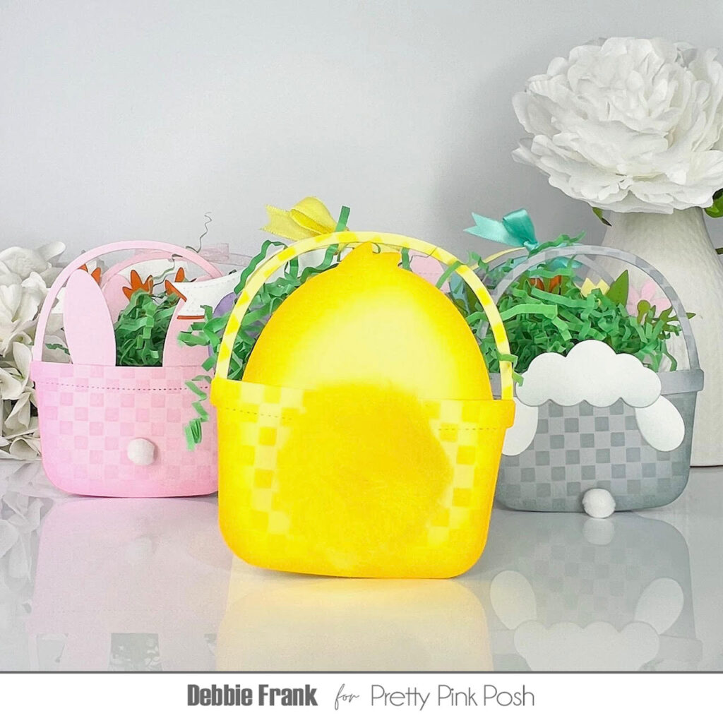
For the back bucket panel I added one white Pom-pom for the bunny bum! After the whole bucket was made I added Glossy Accents to the nose and set it to the side to dry.
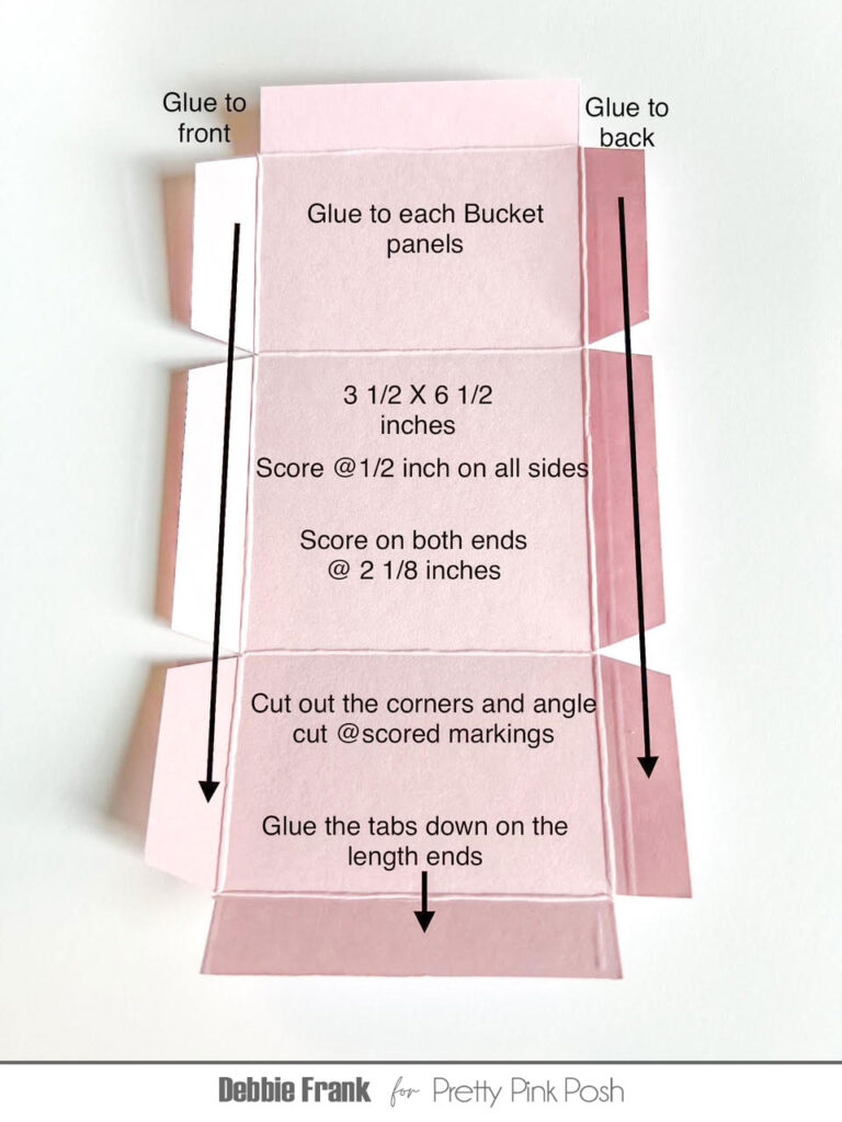
To make the treat box I made my own piece to glue in between the two bucket panels.
For the second Candy Bucket treat box I made the Chick from the Easter Bucket Additions.
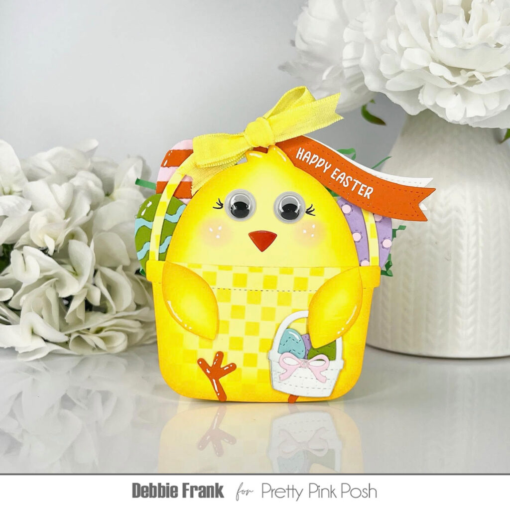
This is the same process with the Candy Bucket and using the Easter Bucket Additions die set. And for the Easter Basket under the wing it is from the Easter Holder Additions die set. I thought it would be cute to have the legs going up to make it look as though it is sitting down.
Then for my final Candy Bucket Treat Box is the Lamb!
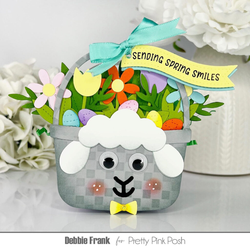
The lamb Candy Bucket is filled with flowers from the Easter Bucket Additions die set as well as more foliage from the Stitched Spring Flowers die set. The small eggs and the bow are from the Easter Holder Additions die set.
And here is the back of these cuties! I just happened to have a big yellow puff ball in my stash, I made the mistake of cutting it in half though. Liquid glue to the rescue!
I hope you like my adorable Easter Bucket Treat boxes. Now it’s time to grab some chocolate Easter eggs to fill them up with! Thanks for stopping by and have a crafty day!