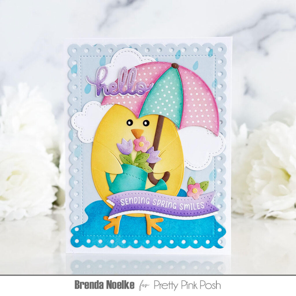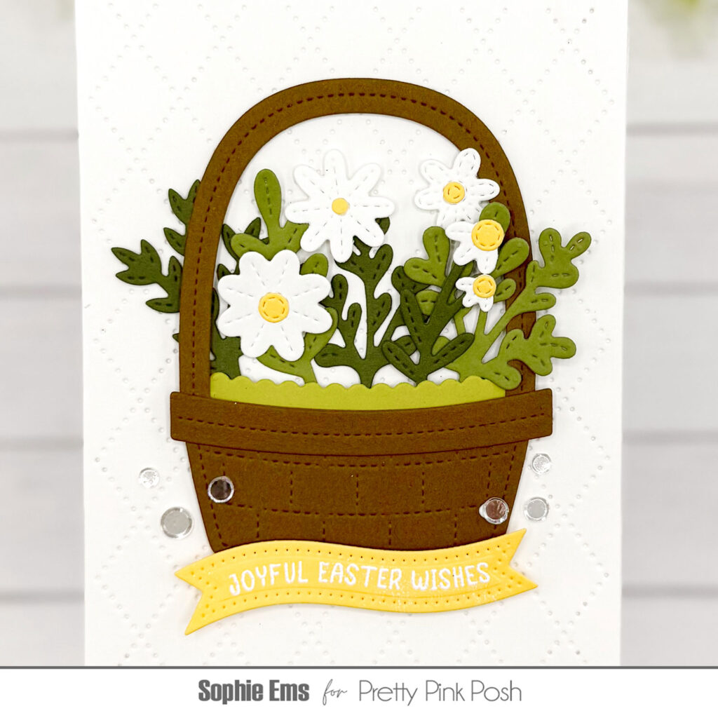
Chick Daffodil Scene
Hi everyone, Sophie here. I’m so excited to be back for the Pretty Pink Posh Spring release and I am absolutely loving all the beautiful stamps and dies.
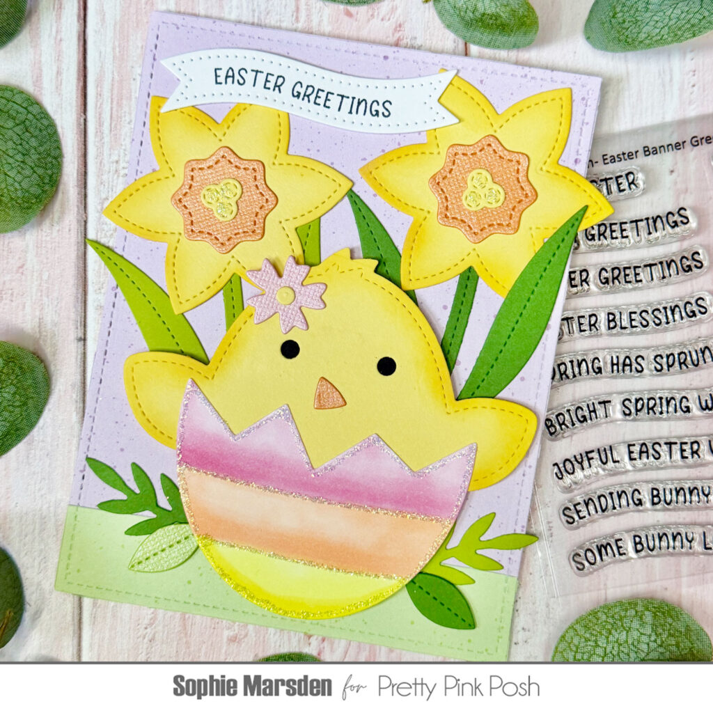
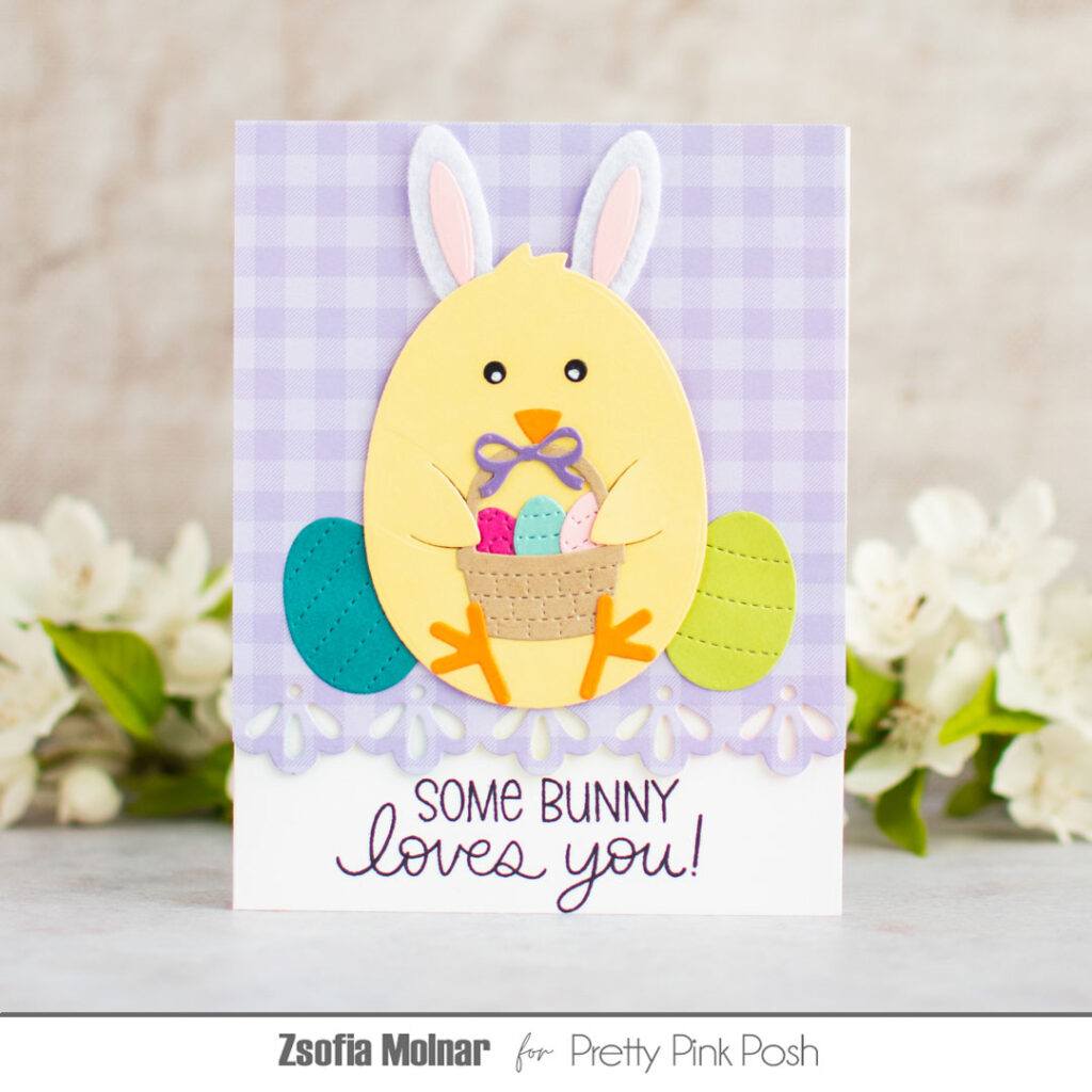
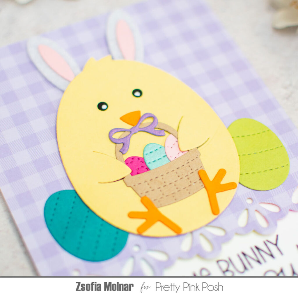
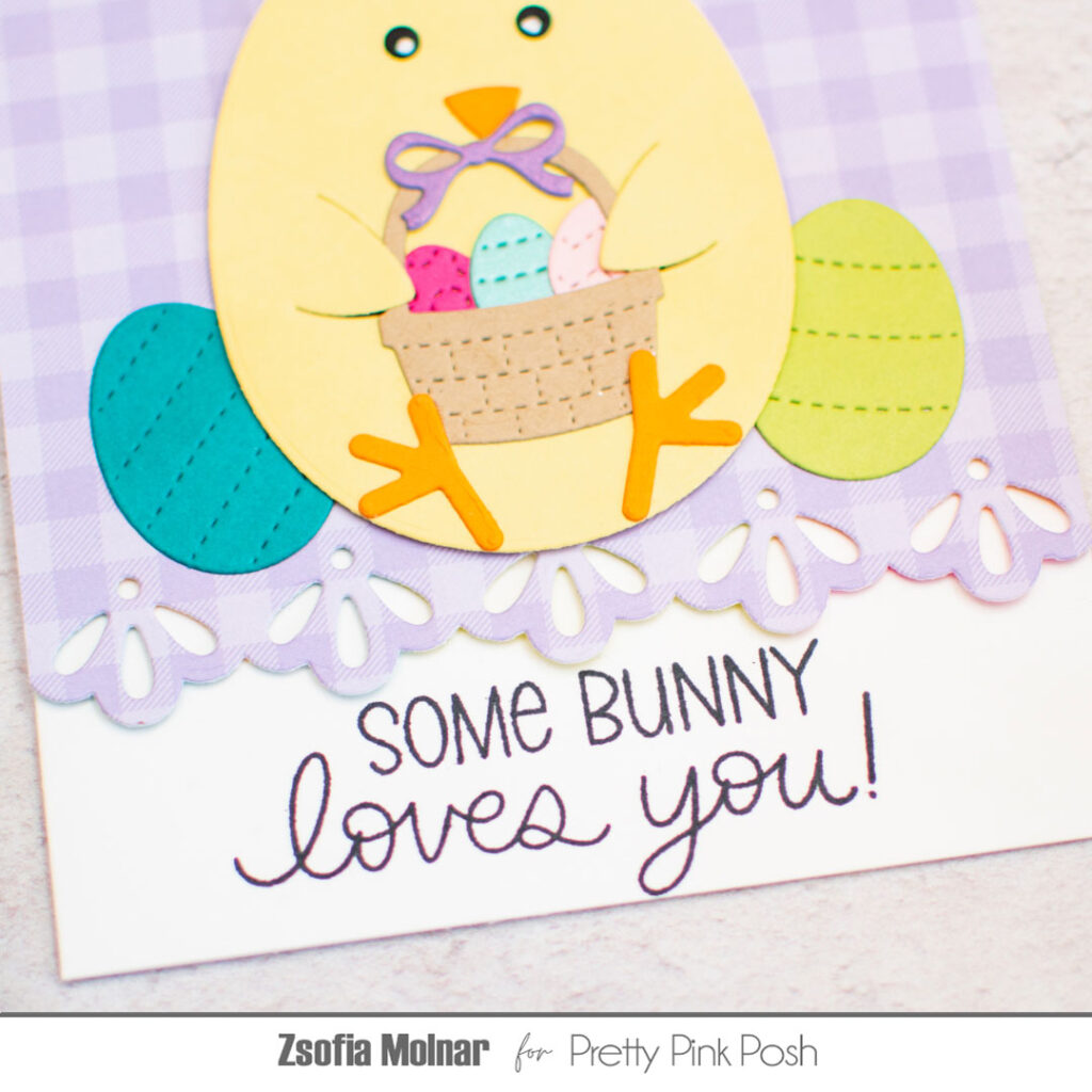
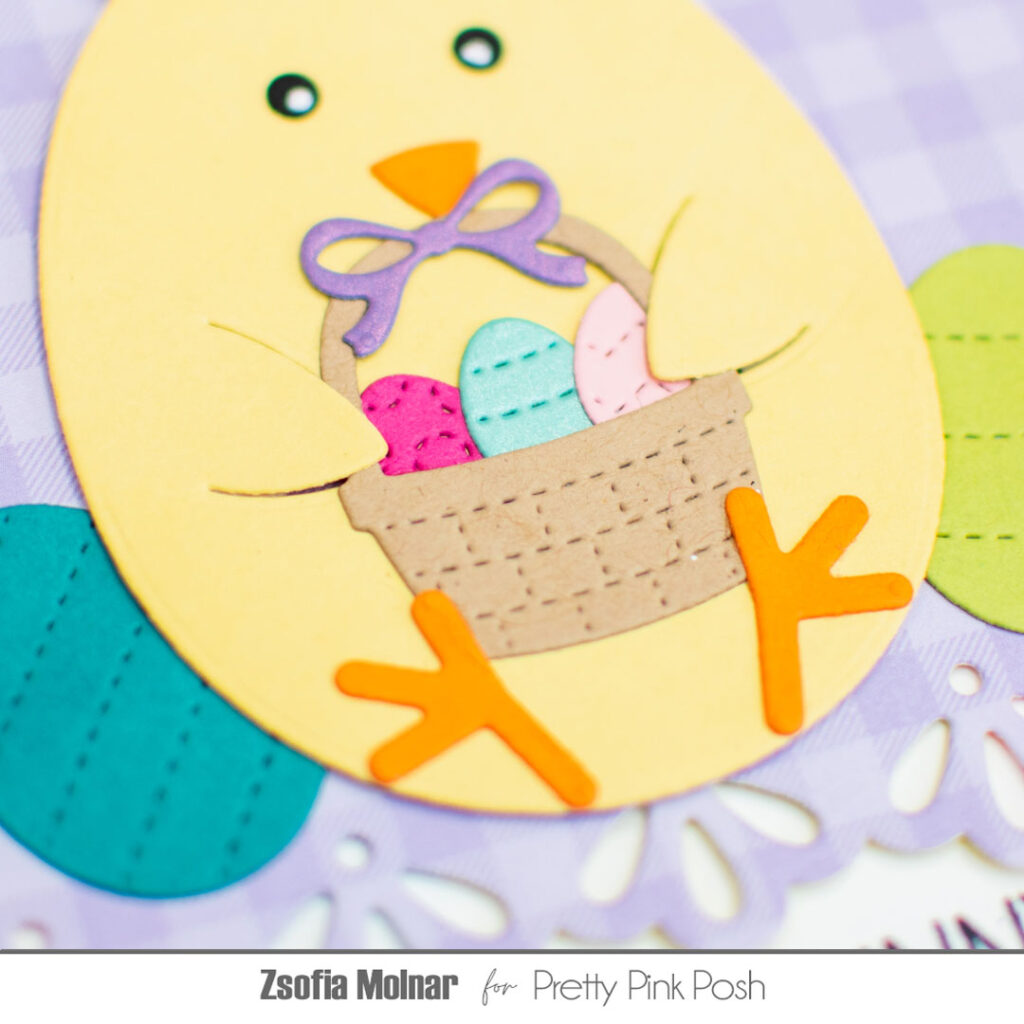
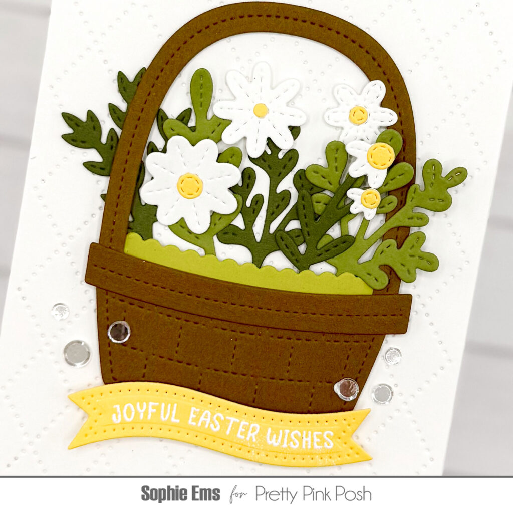
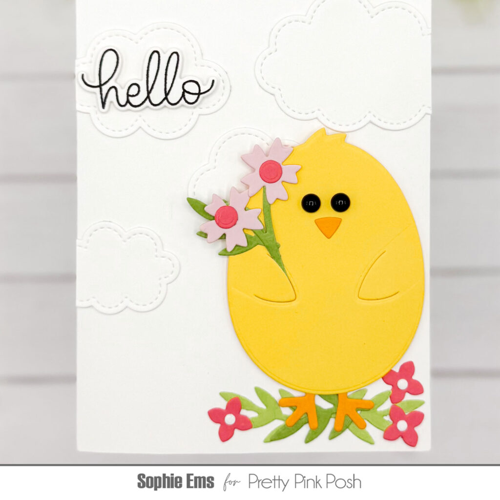
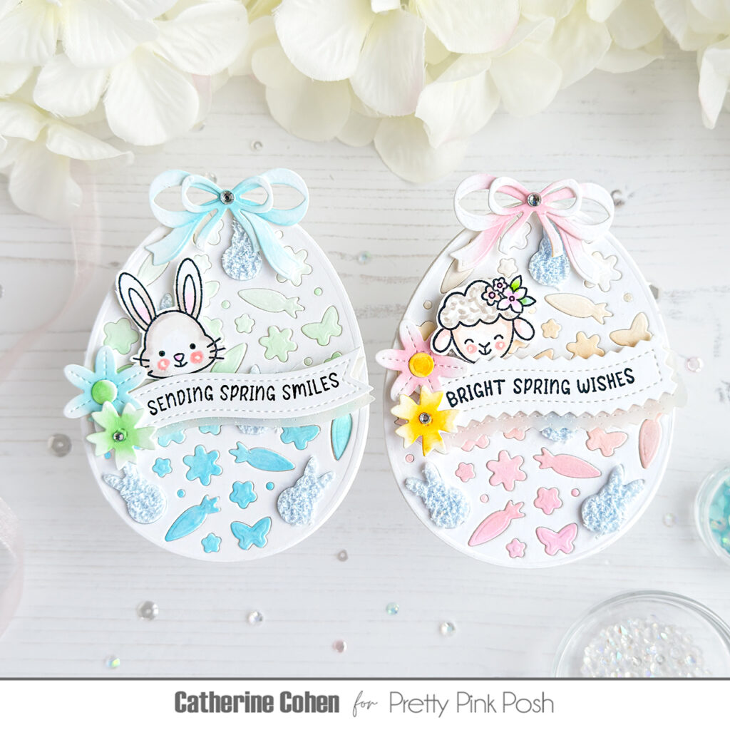
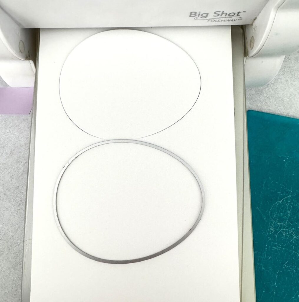
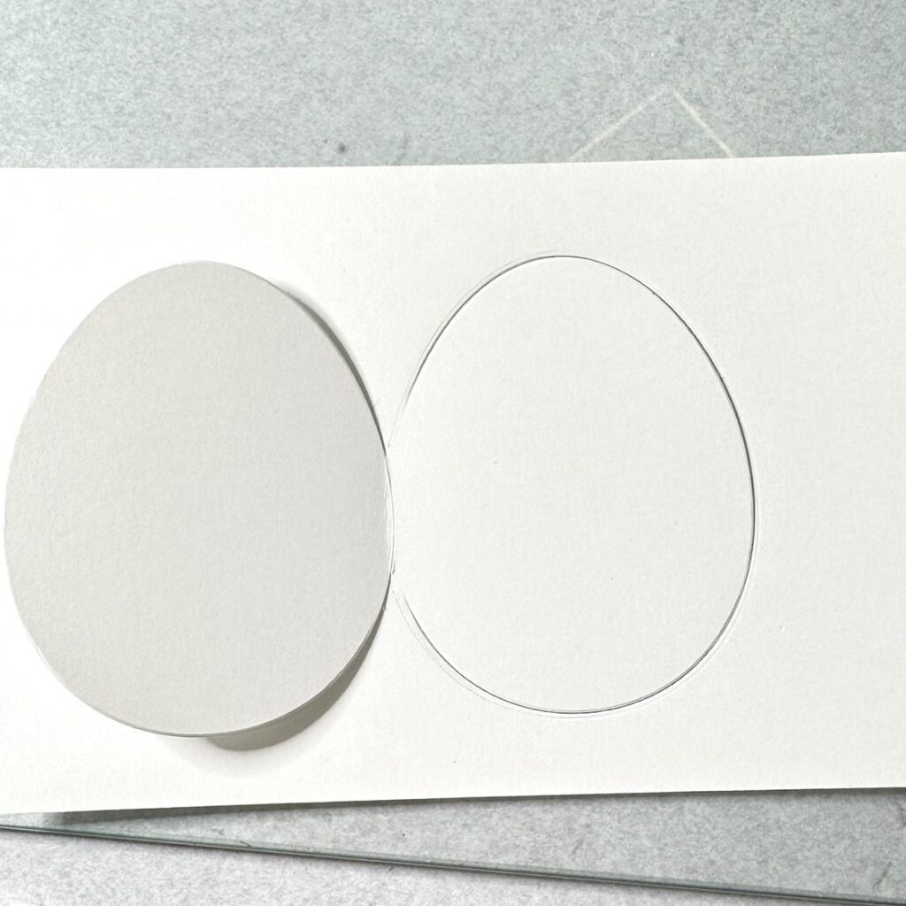
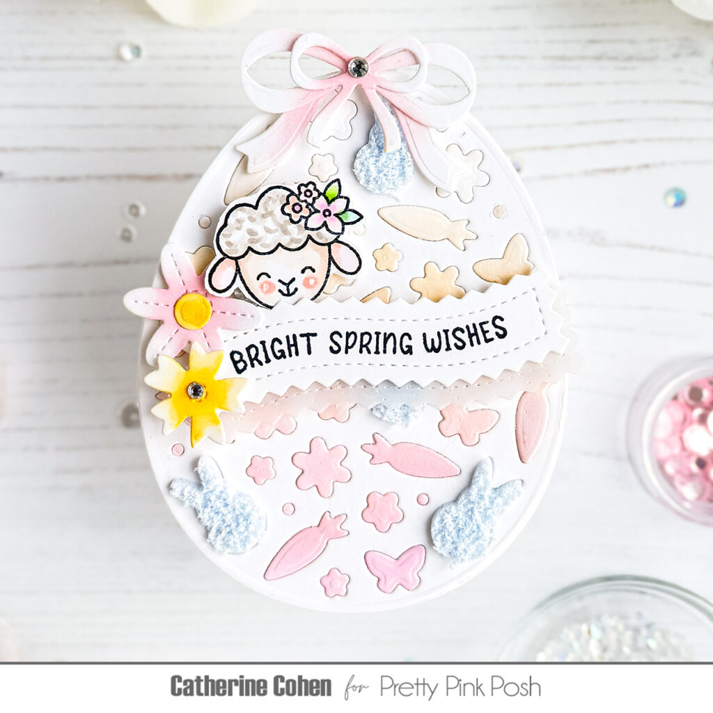
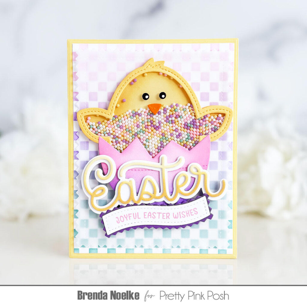
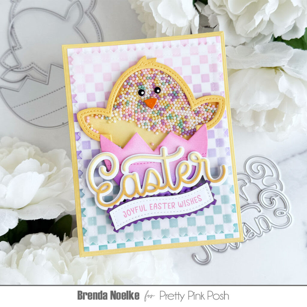
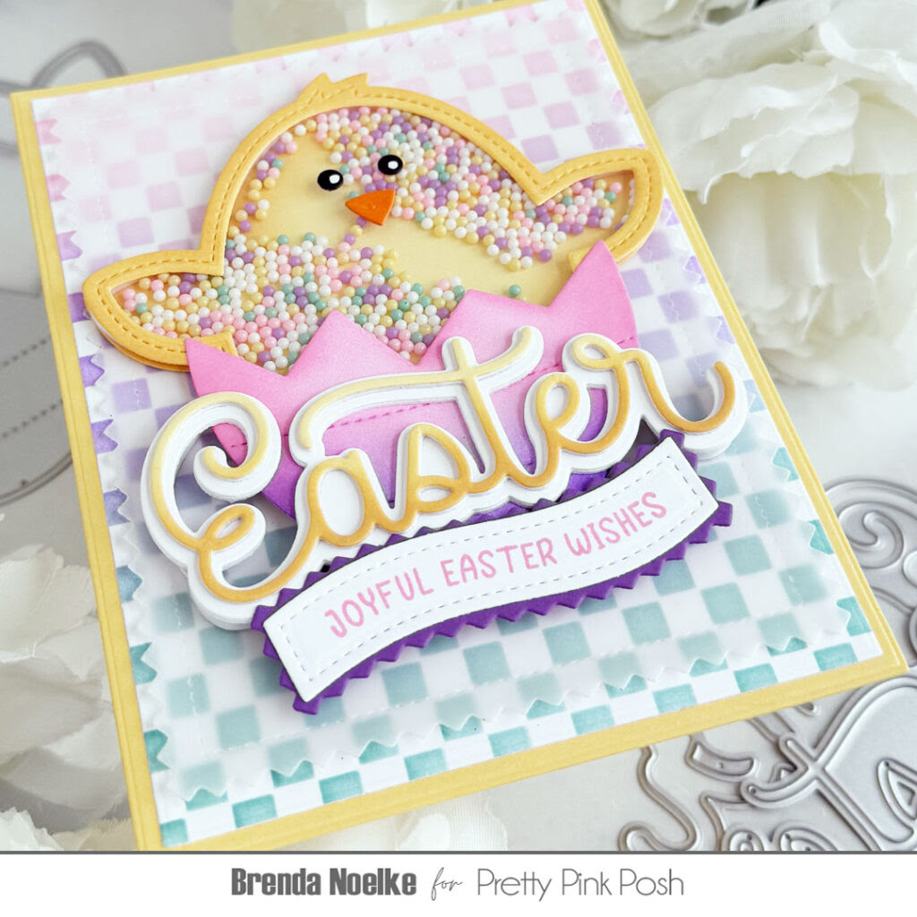
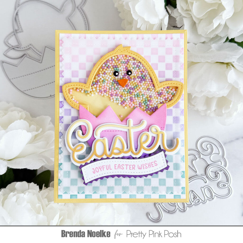
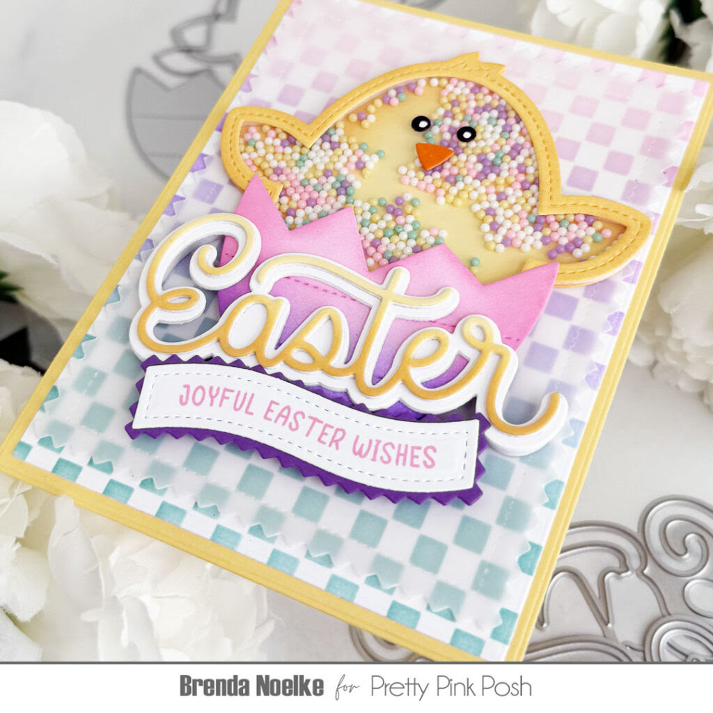
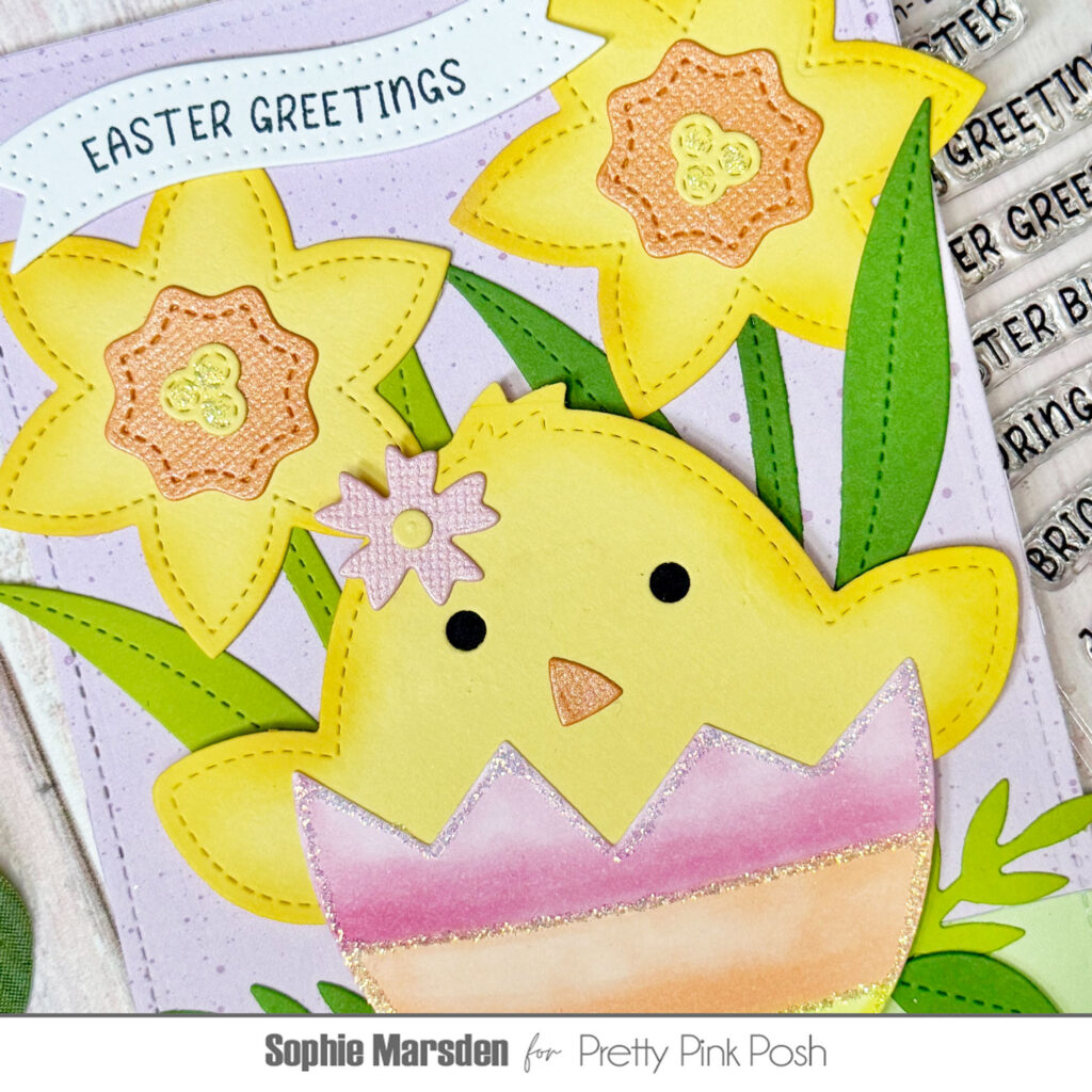
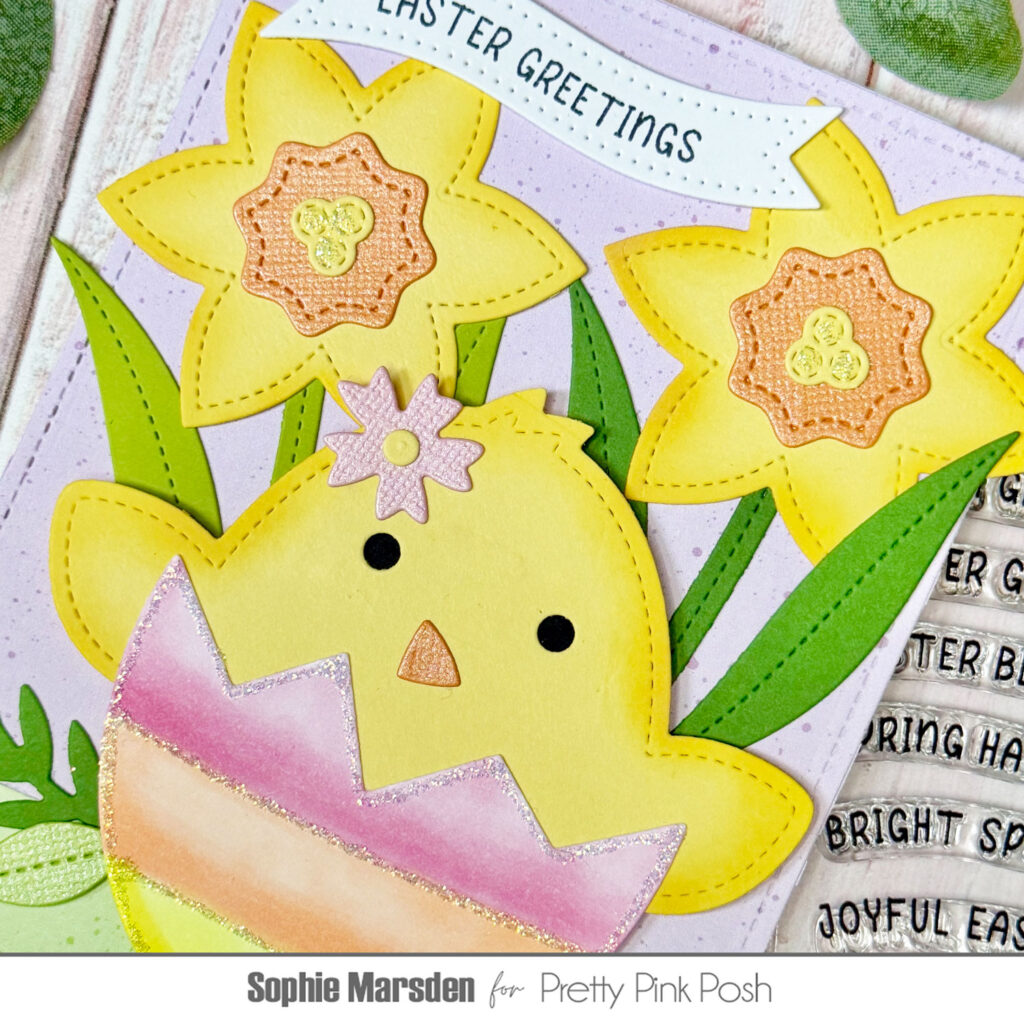
For this card I started with the Chick Shaker dies, cutting the chick from yellow card and the broken egg from white card that is compatible with Copic markers. On the chick I added some subtle ink blending with some ‘Fossilised Amber’ Distress Oxide ink and a pink flower in its ‘hair’. On the egg I coloured in each section using Copic markers in shades of pink, orange and yellow. This is my favourite colour combination for Easter / Spring cards because it’s so bright and happy. For some sparkle I also outlined each section with glitter glue.
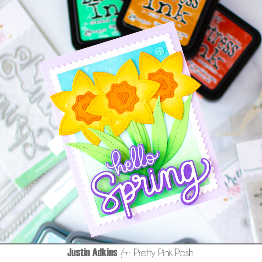
For the background flowers I used the Daffodil Shaker dies, once again adding some ink blending to the petals. I added glitter glue to the stamens in the middle of the flowers for a subtle hint of sparkle.
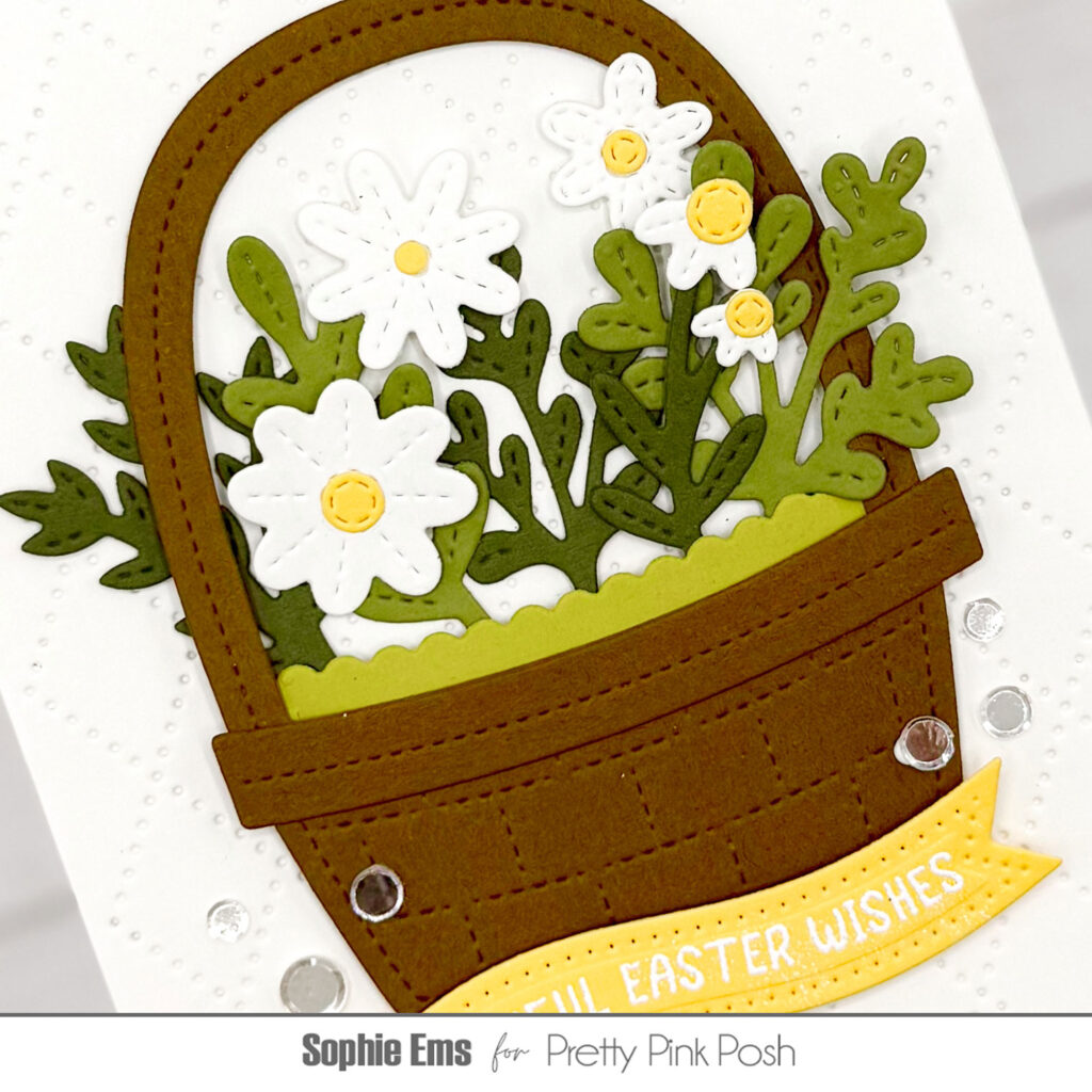
I added extra greenery from the Stitched Spring Flowers Dies in various shades of green and finished the card by stamping a sentiment from the Easter Banner Greetings stamp set into a Banner Greetings 3 die.
I love how versatile the Chick Shaker and Daffodil Shaker dies are. While you can make the most beautiful shaker cards with them, you can also make a standard card with them that looks just as pretty. Being able to use a die in a variety of ways is something I always look for, and the PPP shaker dies always fit that brief!
I hope everyone is enjoying the Spring release – I know I am! Happy crafting everyone!