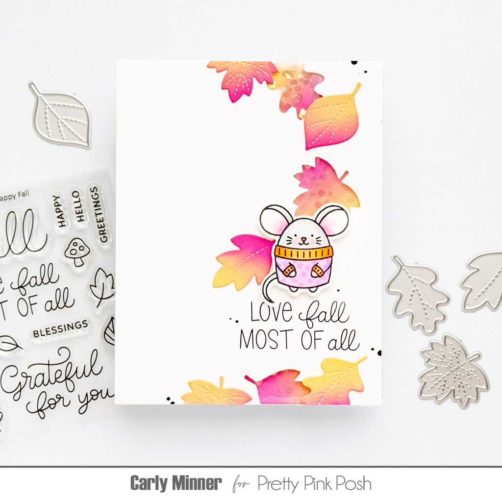
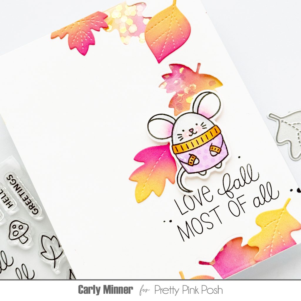
Hi friends, Carly here. I’m so excited to share my latest card with you because it’s my favorite type of card to make and it’s for my favorite season…a falling leaves shaker!
I thought Pretty Pink Posh already had the best fall sets (hello Falling Leaves & Cozy Fall Critters) but then they came out with the most amazing collection this September! I’ve been having so much fun with theFall Holder Additions!
It’s the perfect size for the Holder dies to hold things but it’s also amazing for grid designs, pairing with critters and shaker windows!
For this card I used the leaves from theFall Holder Additions to make shaker windows and also as decorative elements to create falling leaves with the mouse from the Cozy Fall Critters set.
The shaker windows go off the edge so the shaker container is made by wrapping leftover plastic around the panel. It’s easy to make and easy to mail!
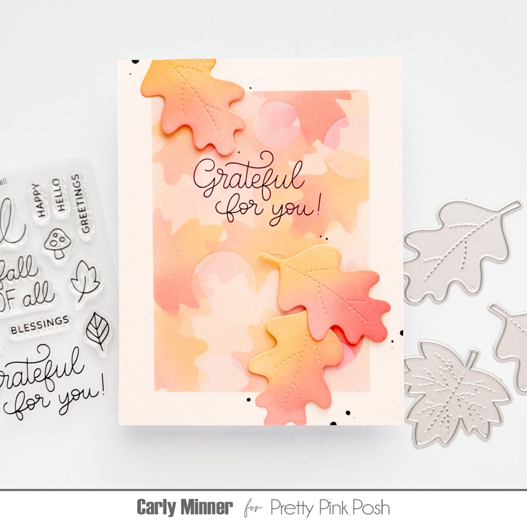
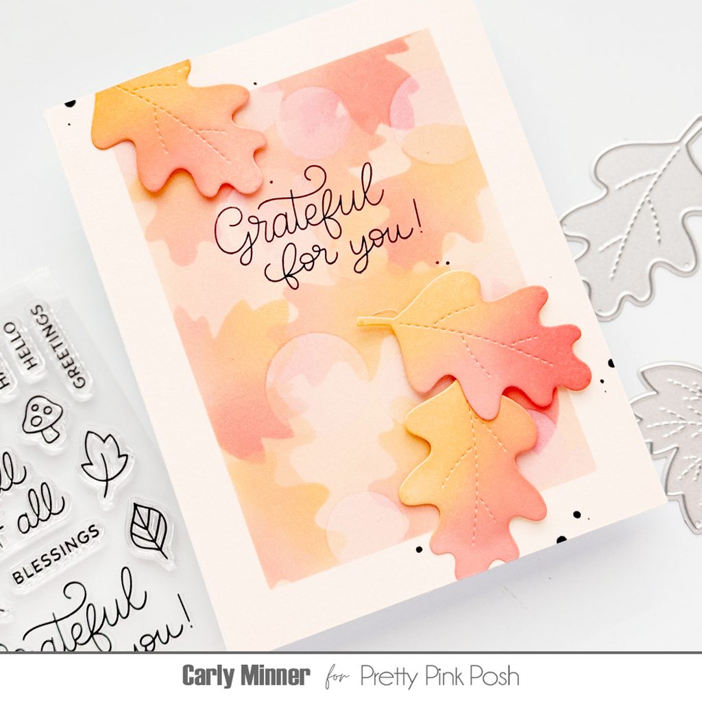
Hi friends, Carly here. Are you looking for a new technique to try on cards this fall? Well I have a fun one to try, an easy bokeh effect with diy stencils! Bokeh is that dreamy, out of focus light in photography and it is easy to mimic with inks for a fabulous card background!
I started by creating diy stencils by die cutting pieces of acetate with the Stitched Leaves and a few circles too. I like to use the acetate for stencils because then you can see exactly where you are inking.
I used masking tape to create a rectangle on pale peachy cardstock and inked blended it a slightly darker color. Then I ink blended through the diy leaves stencils with Distress Oxide Dried Marigold, Abandoned Coral and Saltwater Taffy.
After I was happy with the number of leaves, I added circles with white ink and a light hand. I wanted the circles to create a soft blur, not cover the leaves.
When I was happy with the background, I removed the tape and added die cut Stitched Leaves on top and a sentiment from the Happy Fall set.
I hope you are inspired to try this technique! Thanks for stopping by!
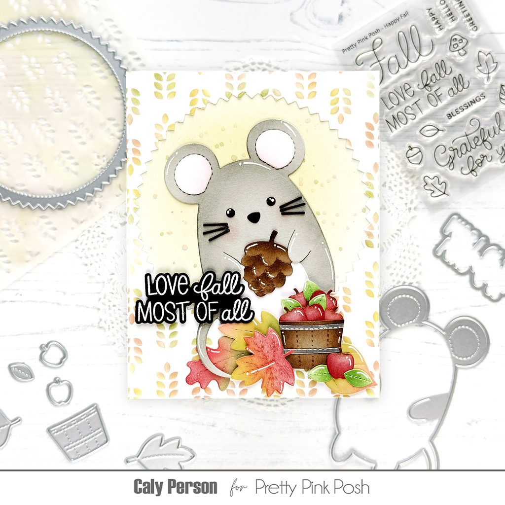
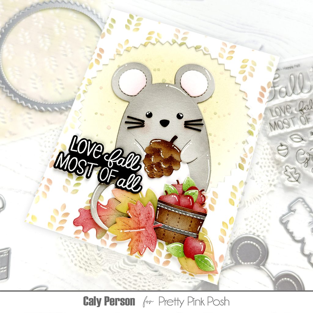
Hello friends! It’s Caly with you today. It’s release day and I’m excited to be here to share a fall project with you using new products from Pretty Pink Posh! Today’s project features the newMouse Holder Diesand Fall Holder Additions Dies.
Be sure to check out the full video to see how I added color to these die-cut elements and how adding little details take your projects to the next level!
I created a fun background using theWheat Pattern Stencilby stenciling the single die with green, yellow, and orange to make it colorful. I also die-cut a circle window using the largestPinking Circles die so the mouse can peek out from the opening.
To finish, I embossed the sentiment from theHappy Fall stamp anddie set in white over black cardstock. I hope you enjoyed this card and that you’ll see lots of great inspiration from this release in the upcoming weeks!
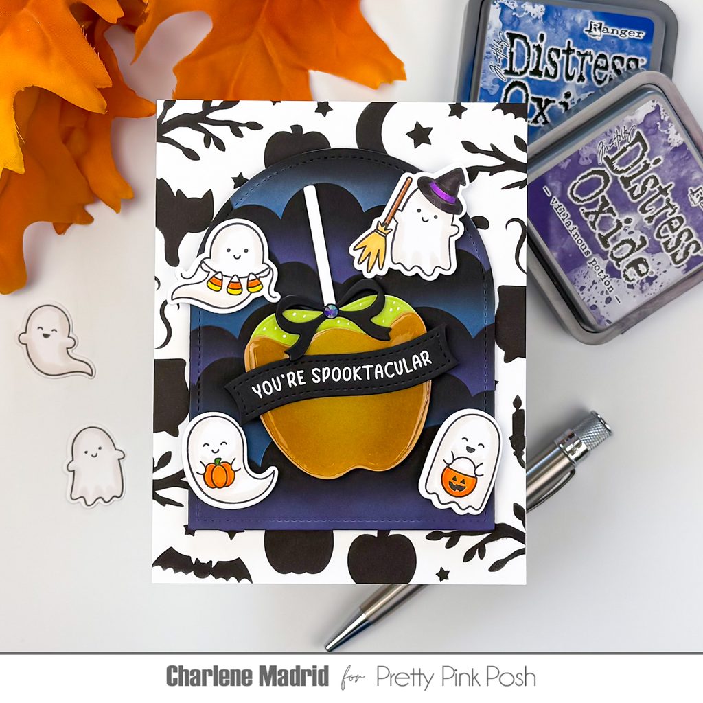
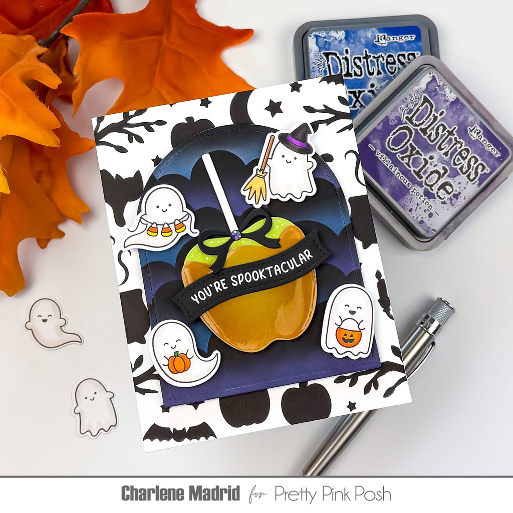
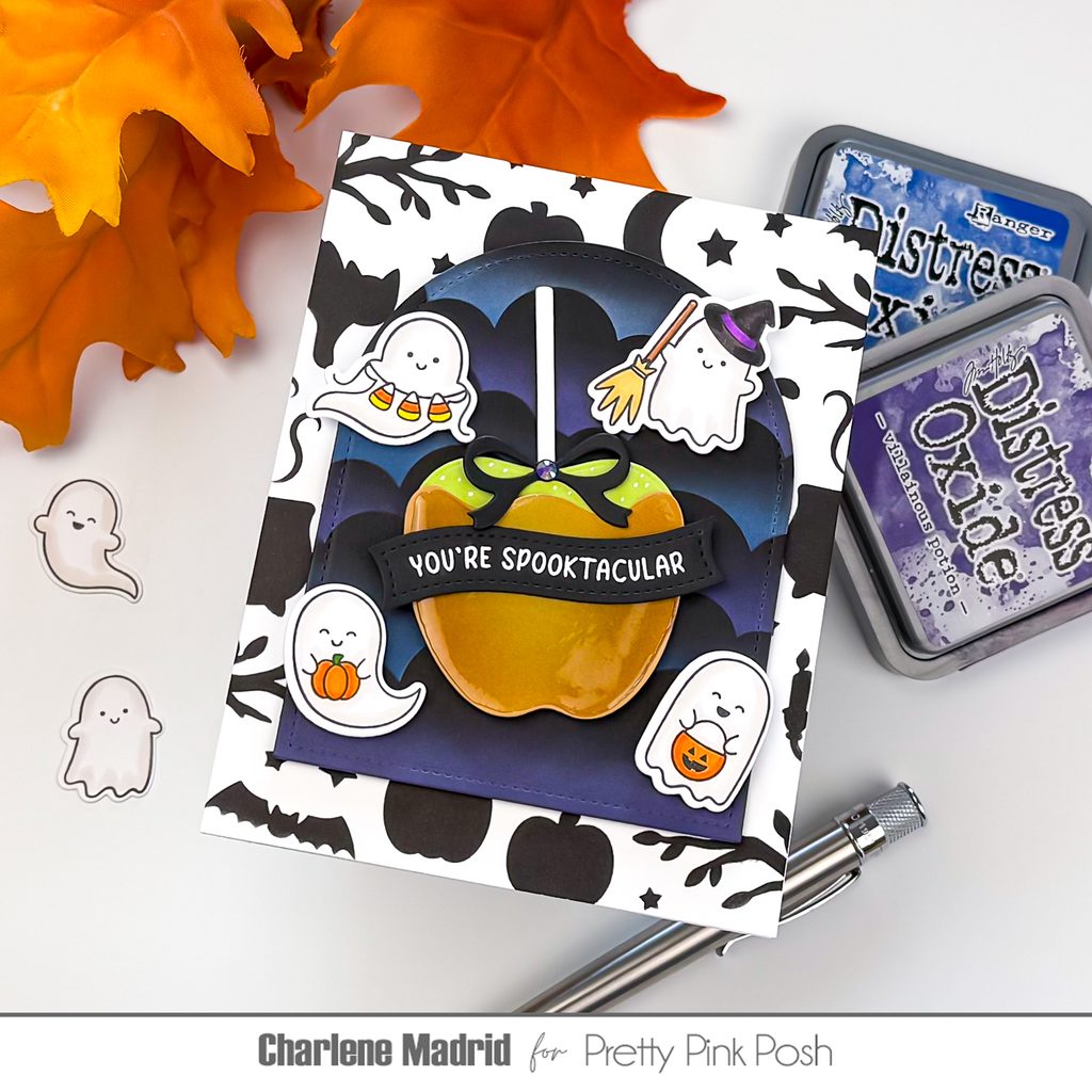
Hi friends, Charlene here! Today I’m sharing a playful Halloween card with a few easy tricks for adding extra dimension and detail. I’ll show you how white pigment ink can help create a glowing blue and purple sky, plus how a little ink blending and Glossy Accents can turn a simple die cut into a realistic caramel apple.
I started with black cardstock and cut out an arch using the second from largest Stitched Arches die. To create the cloudy background, I blended white pigment ink over the Clouds Stencil, shifting and rotating the stencil as I worked my way down the panel.
I made sure to leave some of the black cardstock showing between the clouds. Once the pigment ink was dry, I blended blue and purple Distress Oxide inks over the white areas. The white pigment ink underneath helps the colors show beautifully against the black cardstock and creates a soft, hazy nighttime sky.
For the card background, I used the Halloween Silhouettes Background Stencilwith black ink on white cardstock. I only needed to stencil around the outer portions of the panel since the center would eventually be covered by the arch and focal images.
Next, I die cut the Halloween Caramel Apple dies from light green and golden brown cardstock. Before adding the shine, I blended light brown ink around the edges and bottom of the caramel layer, keeping the center lighter. This simple shading helps give the caramel some shape and warmth.
Then came the fun part! I covered the caramel with Glossy Accents, first outlining the edges and then slowly filling in the center. I let the piece dry overnight so the Glossy Accents had plenty of time to create a smooth, candy-coated finish.
One quick tip: Glossy Accents can cause cardstock to curl slightly as it dries. Once the piece is completely dry, placing it underneath a heavy book is an easy way to flatten it again without damaging the glossy surface.
For the Mini Ghosts, I added soft warm gray shading around the edges and folds to give them a little more dimension while keeping them cute and playful. I also added simple coloring to the pumpkins, candy corn, broom, and witch hat. Since these images are small, just a little shading is enough to make them feel polished.
To assemble the card, I popped the arched sky up with foam tape and arranged four of the ghosts around the caramel apple. I added a black bow to the apple and used a white gel pen to add a few highlights to the green portion. Those tiny white details help give the apple an extra bit of shine and make it feel more realistic.
I finished the card by placing the sentiment across the apple and adding a small purple gem.
I love how this card stays cute and playful while all those little details make the finished design feel extra special. The glowing sky, shiny caramel, soft shading, and white gel pen highlights are all simple techniques you can use to add more dimension to your Halloween cards.
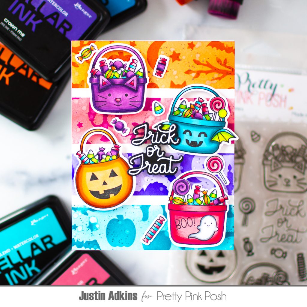
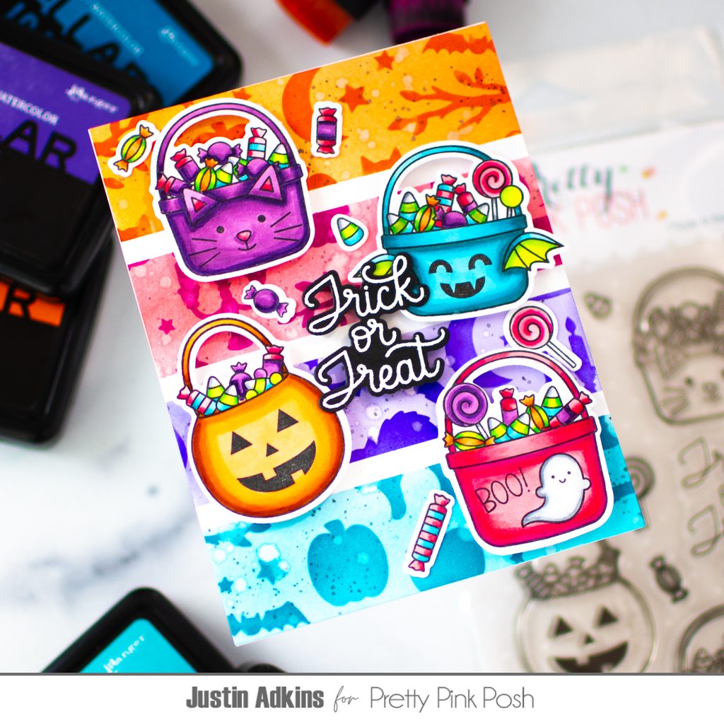
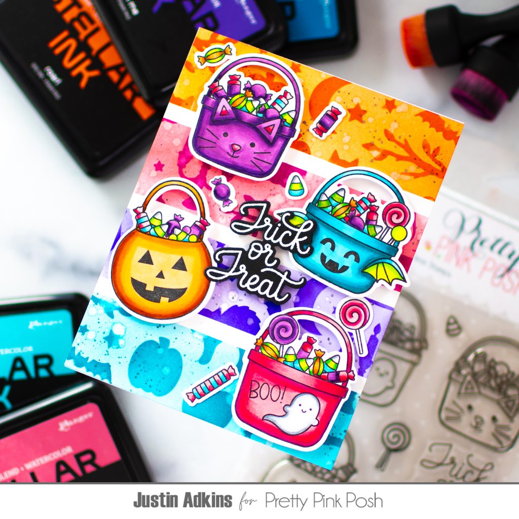
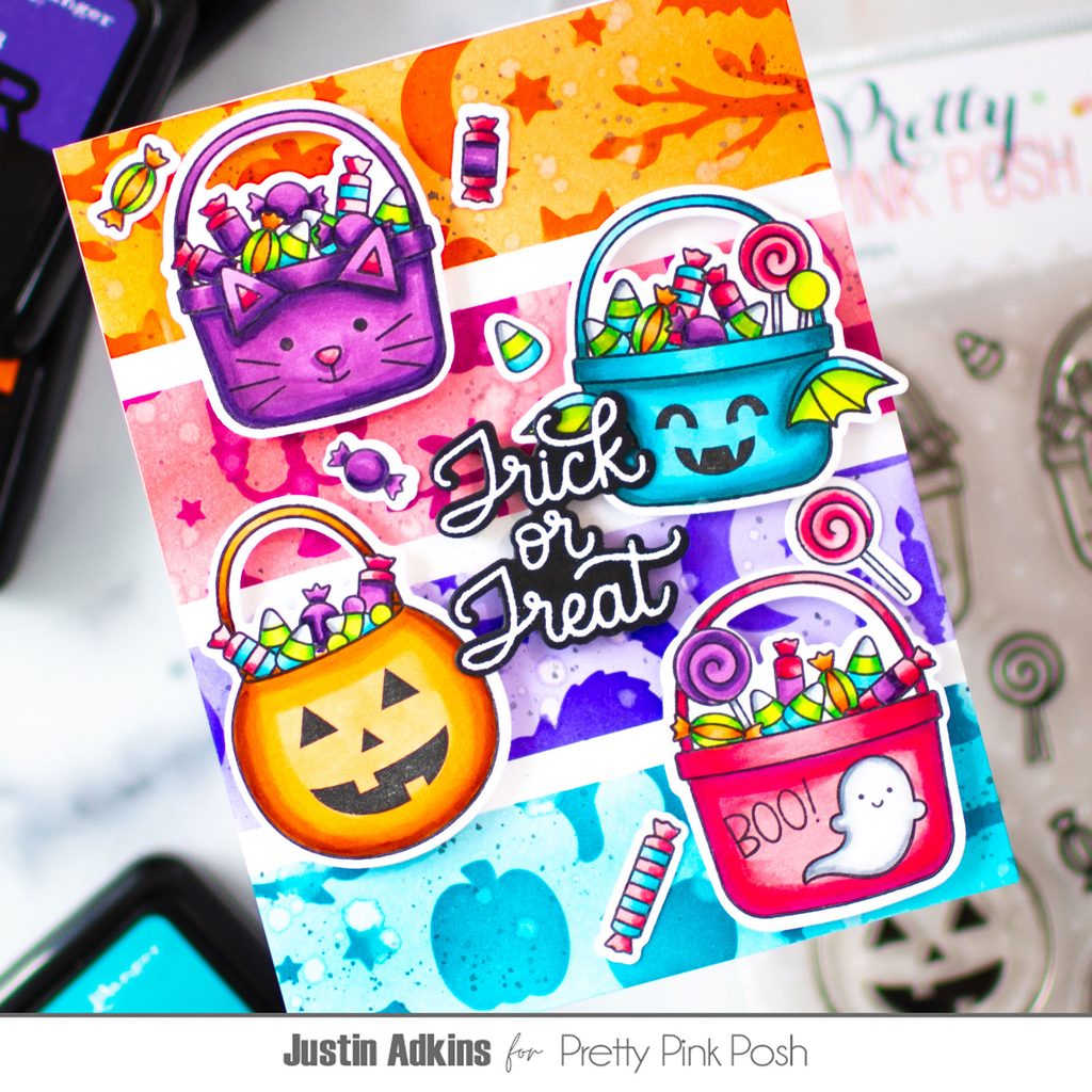
Hello, crafty friends! Justin here, and today I’m sharing a colorful Halloween card featuring the Halloween Treat Buckets Stamp Set and Halloween Silhouettes Stencil. I also created a video tutorial for this project, where I walk through the techniques and show you exactly how this card came together.
The main technique I wanted to highlight on this card is color-blocked ink blending.
I started by using 1/4-inch low-tack tape to divide my card panel into four equal sections. Once the sections were established, I added additional masking to keep the ink and stencil designs contained within each area.
I used this same approach for both the ink-blended background and theHalloween Silhouettes Background Stencil, allowing each section to have its own distinct color palette. The result is a bright, graphic background that gives the card plenty of energy without overwhelming the focal images.
This technique is also a great way to get more creative with your stencils. Rather than blending one color across an entire panel, try dividing your background into sections and experimenting with different color combinations!
I used a combination of foam tape and liquid adhesive to adhere the images, creating a mix of dimension and depth throughout the card.
Finishing Touches
For the sentiment, I heat embossed it in white embossing powder onto black cardstock. The high-contrast sentiment helps it stand out against all of the colorful elements while adding a classic Halloween touch.
I love how the combination of bright colors, adorable Halloween images, and bold silhouettes creates a card that feels festive without relying solely on traditional Halloween colors.
I hope this project inspires you to try color-blocked ink blending and maskingon your next Halloween card. A simple strip of low-tack tape can open up so many possibilities!
Thanks so much for stopping by, and happy crafting! For even more inspiration, be sure to follow me on Instagram andYouTube@justanotebyjustin.
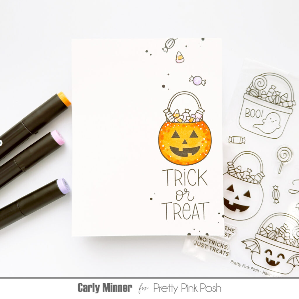
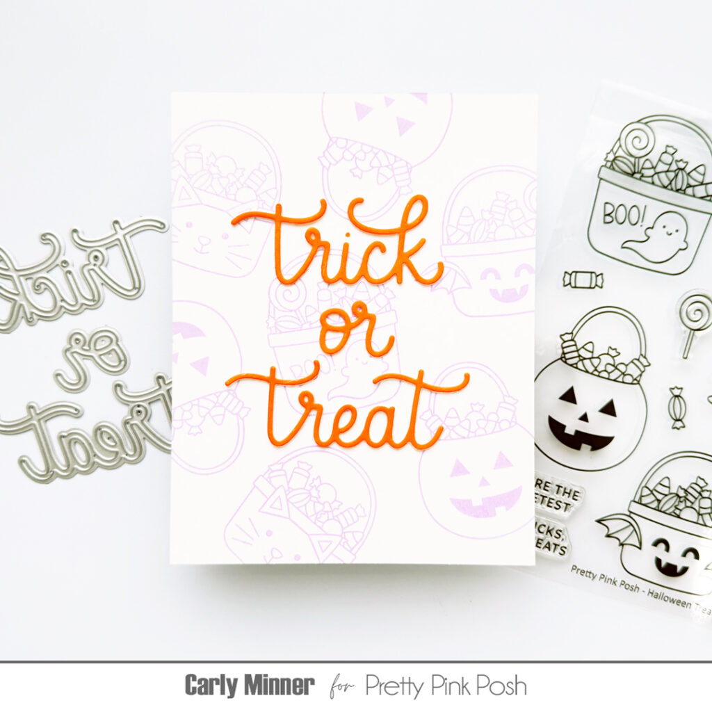
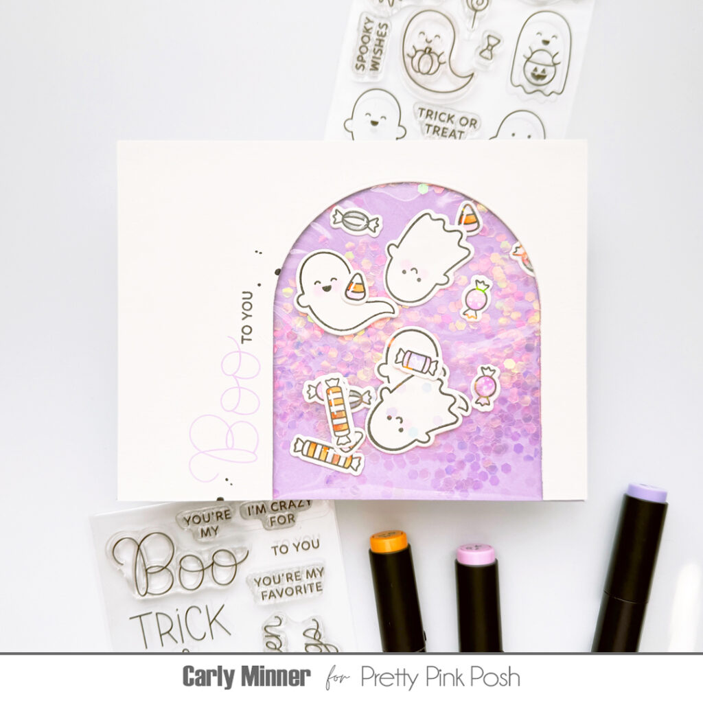
Hi friends, Carly here. I love dies and solid stamps but outline stamps have such a special place in my heart! They are so fun to create with, so versatile and they are absolutely what caused me to fall in love with cardmaking! Today I want to share four of my favorite, fail proof card designs for outline stamps!
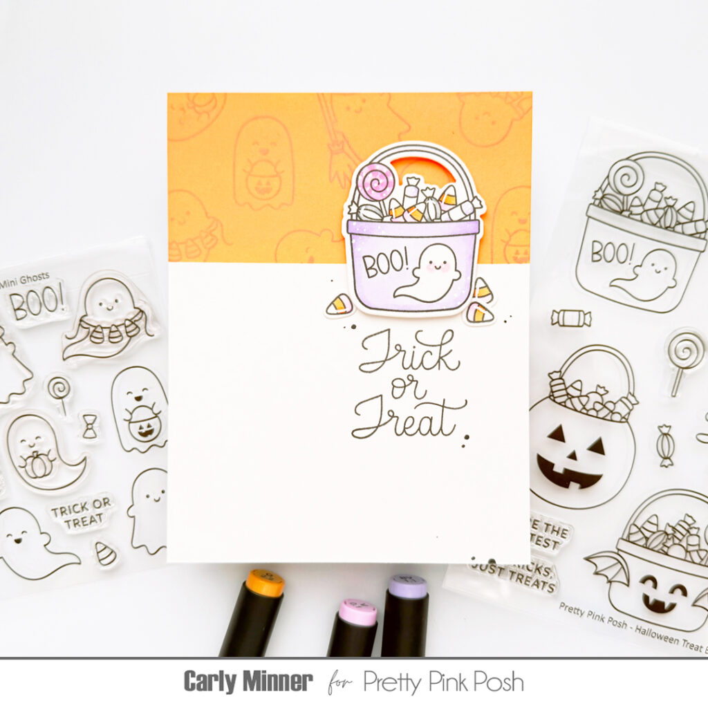
The first one is clean and simple! Stamp an image and sentiment(s) on a white card, leaving lots of white space. I like to place a the image in a few different positions on the card…front & center, bottom right corner and in a vertical strip on either side like the Jack ‘O Lantern treat bucket card.
The second design is to create a fun background by stamping the images all over a card front and then adding a die cut sentiment in the middle like the purple stamped background & orange “trick or treat” card.
The third design is what I like to call a “scene strip”! I like to mask a section of the card and ink blend (or a strip of colored cardstock works too). Then I stamp images that create a scene or background. After I add a stamped, die cut and colored image and a sentiment stamp.
And the last one that makes me tremendously happy is using stamped, colored and die cut images as shaker bits! They are so fun mixed with super chunky glitter, sequins or clay confetti!
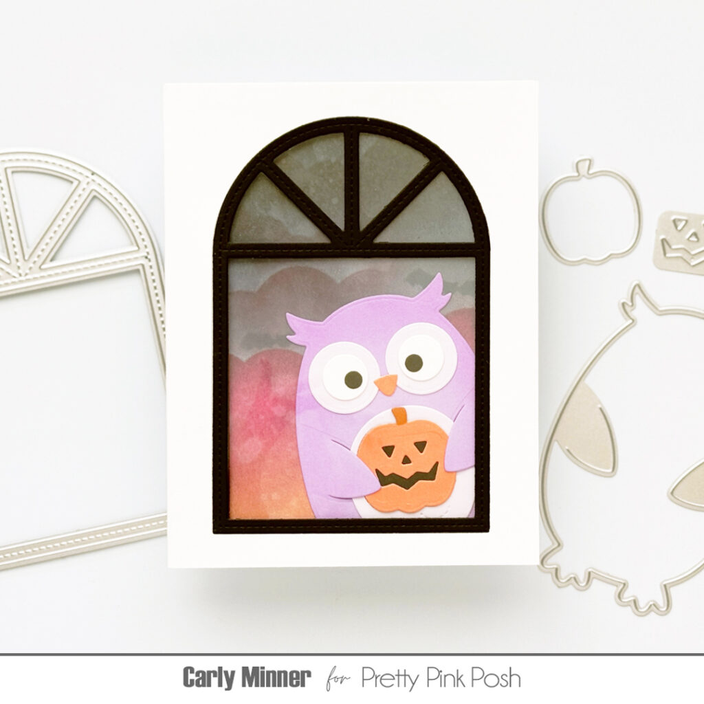
Hi friends, it’s Carly here today. Are you looking for an easy interactive card to make? How about a tri-fold card with a window? It’s so simple, you just need to adhere two A2 cards together!
I started by scoring and die cutting two side-fold A2 cards. From the front of one card I used one of the windows from the Stitched Windows 1 to die cut an opening. After adding acetate, I adhered another A2 panel with a matching window on the inside.
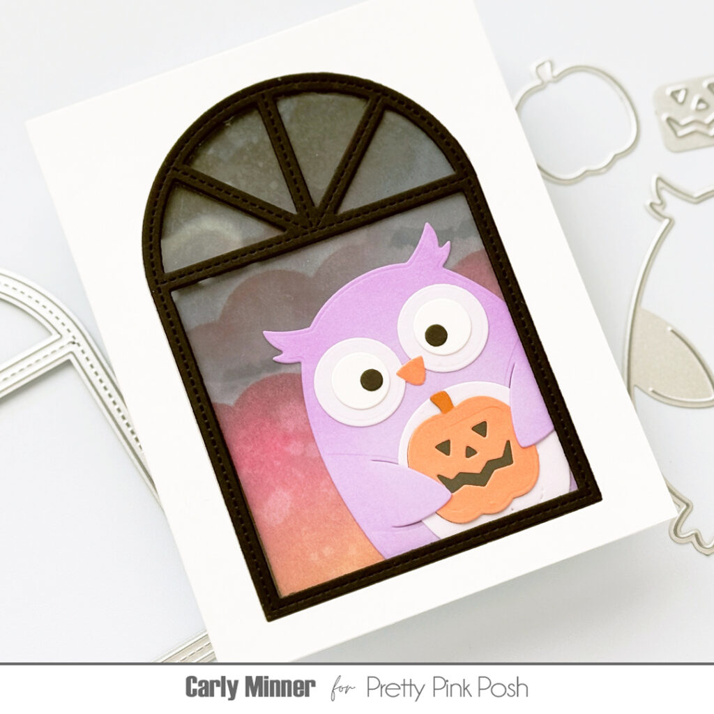
On the front of the second card, I ink blended and stencilled a not-to-spooky sky. Then I added a cutie pie purple Owl Holder. Love him!!!
And finally, I adhered the back of the ink-blended card to the inside of the window card to create a tri-fold card! You can use this technique with any of the holder dies, too!
Be sure to hop along in the video hop on YouTube for lots more inspiration with the new release, and if you leave comments, we’re giving away a gift card at each video stop!
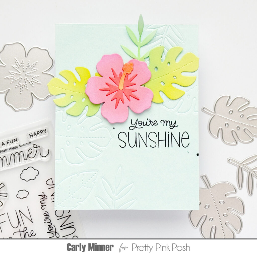
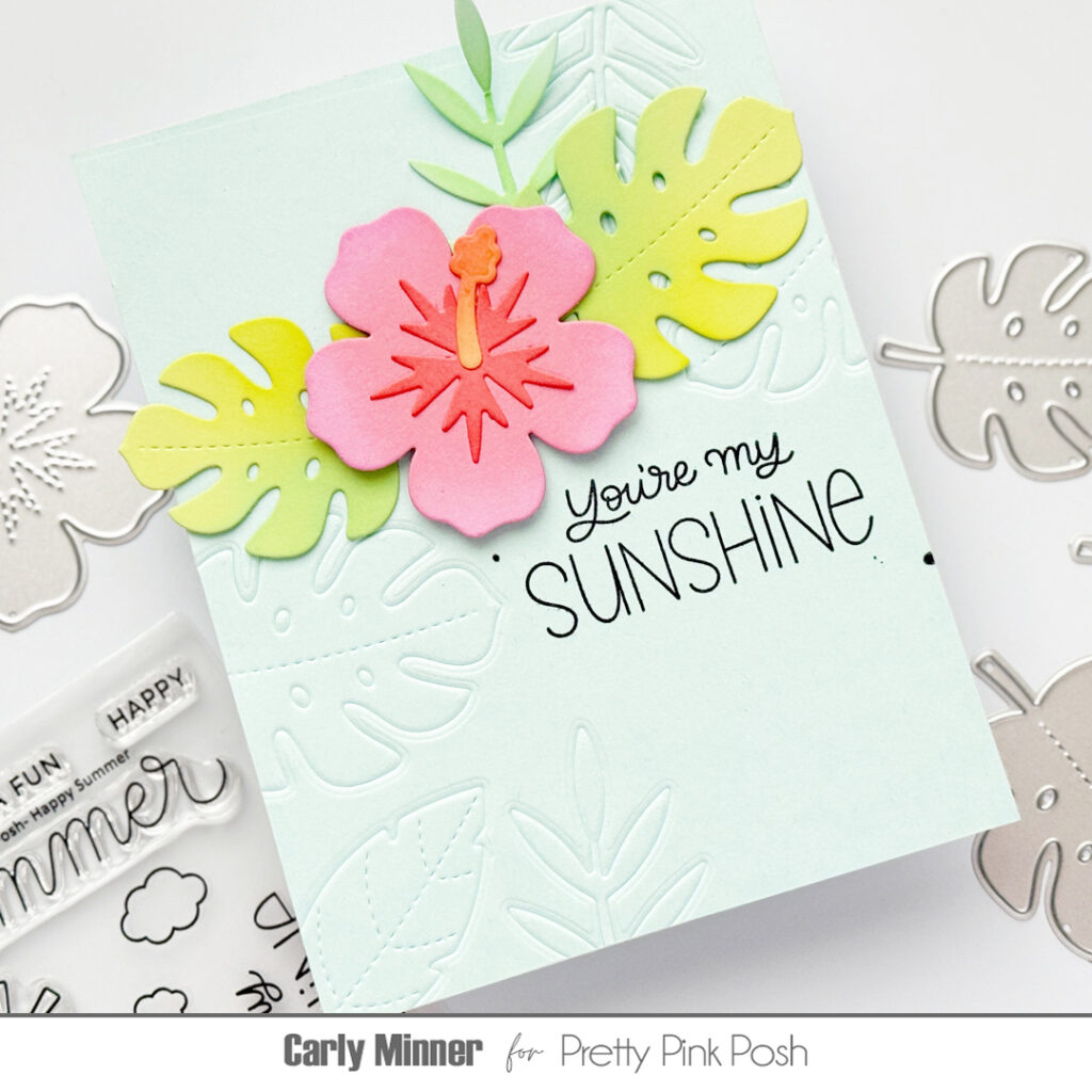
Hi friends, it’s Carly here. Do you ever use your cutting dies for embossing? It’s such a fun & easy way to stretch your supplies and create beautiful texture on your handmade cards!
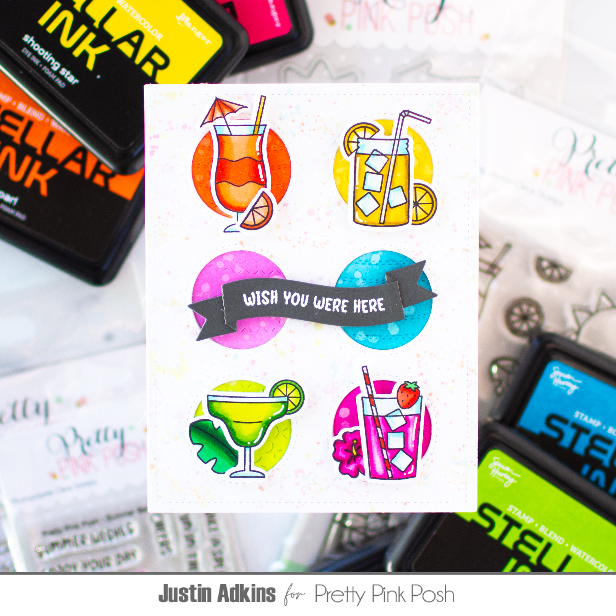
Hello, friends! Justin here and I’m excited to be back on the Pretty Pink Posh blog sharing another bright and colorful project featuring products from the Pretty Pink Posh Summer Collection.
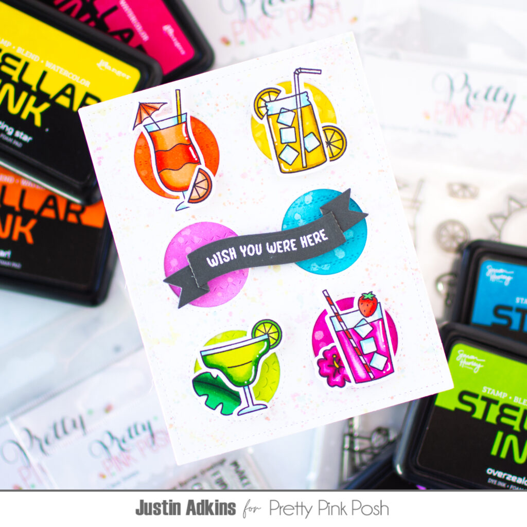
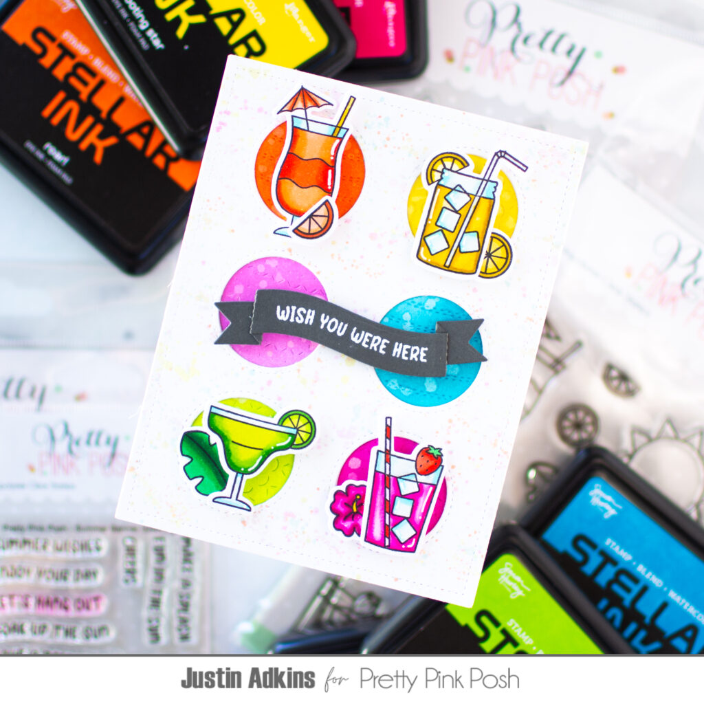
For this design, I created a playful grid layout by pairing the Ornament Cover Plate Die with four colorful drink images from the Summer Sips Stamp Set. Each drink was colored with OLO Markers, while the circular backgrounds were ink blended using Stellar Inks. I gave each circle its own monochromatic color palette to help every image stand out while keeping the overall design cohesive.
To add extra depth, I used a simple stacked die-cut technique by layering multiple Ornament Cover Plate die cuts. This creates beautiful dimension without relying on bulky foam adhesive and gives the card a polished, professional finish.
Thanks so much for stopping by today! I hope this project inspires you to mix bright colors, fun summer images, and dimensional die-cutting in your next cardmaking session. For even more inspiration, be sure to follow me on Instagram andYouTube@justanotebyjustin.
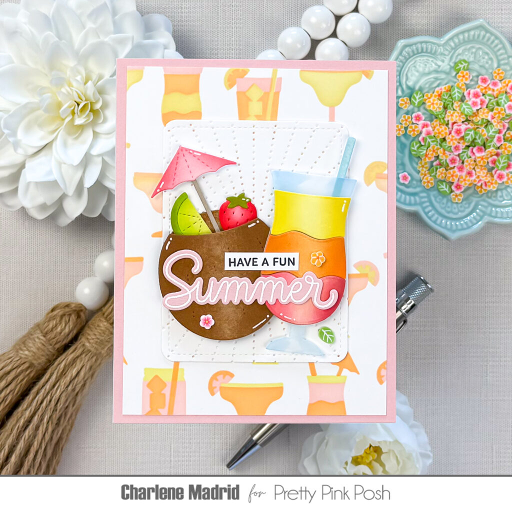
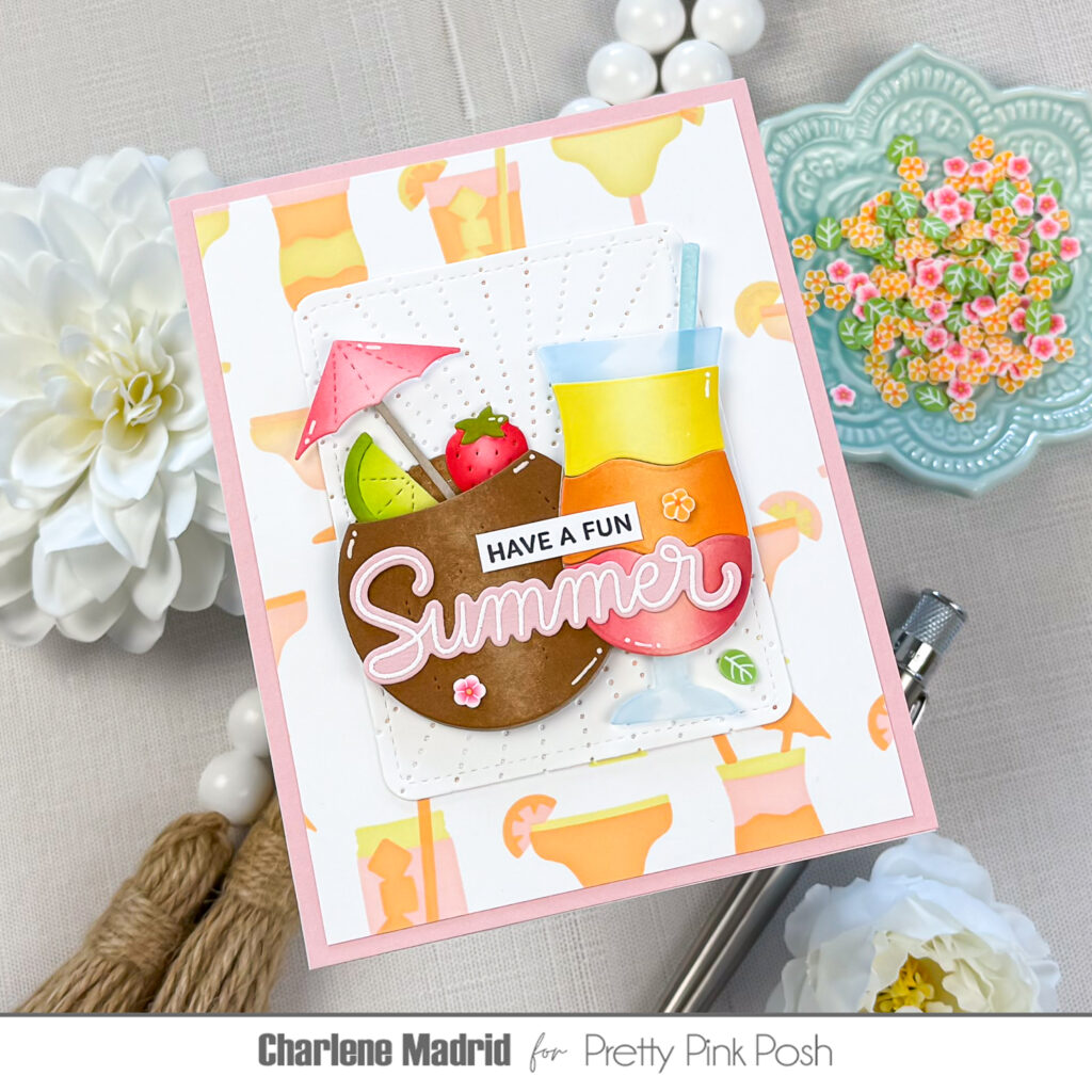
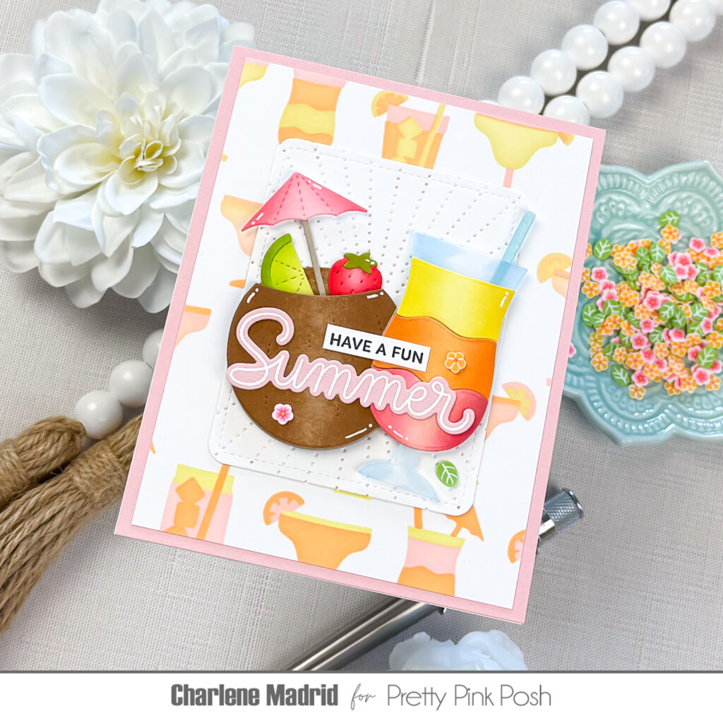
Hi friends, Charlene here! Have you ever wondered how to make a die-cut drink glass actually look like glass? Today I’m sharing a simple vellum trick that adds translucency, definition, and a surprisingly realistic finish.
I began by die cutting the coconut from kraft cardstock and adding light brown ink around the edges. Keeping the center lighter creates a natural highlight and helps the coconut appear rounded instead of flat.
I used the same idea for the colorful drink layers. Each piece received a light layer of ink followed by a darker shade blended inward from the sides. Leaving a lighter area through the center creates a consistent highlight across the pink, orange, and yellow layers.
The vellum glass is the star of this card. I die cut the glass from vellum, then used a very light blue alcohol marker to flick color inward from the outer edges. I left most of the center translucent so the piece would retain that clear, glass-like appearance. After attaching the colorful drink layers behind the vellum, the glass immediately looked more dimensional and realistic.
To keep the design cohesive, I repeated the same colors throughout the smaller die-cut details. The pink umbrella coordinates with the bottom drink layer, while the strawberry, lime, and aqua straw add playful pops of color. I tucked the fruit and umbrella inside the coconut and used foam squares beneath the top layer to give the drink extra fullness.
I also positioned the umbrella and straw at similar angles. Repeating those diagonal lines helps balance the two drinks and gives the finished scene a relaxed, easygoing feeling.
For the background, I blended pink, orange, and yellow ink through the Layered Summer Drinks Stencils. I changed the order of the colors on each stencil layer, creating plenty of variety while keeping the palette consistent with the focal images.
Because the background has so much color and movement, I added a white rectangle to give the drinks a quiet place to rest. I ran the panel through my die cutting machine with the Sunburst Pierced Plate Diefor subtle texture that would not compete with the colorful die cuts.
The sentiment combines a small stamped strip with the larger die-cut word from the Happy Summer stamps. I stamped “HAVE A FUN” in black, then heat embossed “Summer” in white on pink cardstock to connect the sentiment with the other pink details.
To finish the card, I added a few pieces of Summer Blooms clay confettiand drew white gel pen highlights onto the die cuts. Those small details add shine and make the finished drinks feel even more polished.
I love how one simple vellum detail completely changes the appearance of the drink glass. I hope this inspires you to try vellum the next time you create a die-cut beverage!