Stitched Felt Bunny & Chick
Hello Crafty Friends! It is Hanh here with you today. I am so excited to share some fun stitched felt cuties with you. Have you ever tried felt stitching? I have seen so many fun felt projects lately and have been so tempted to give them a try. But alas I have not had a chance to try any of them. I was making some cards with Pretty Pink Posh shaker dies when it occurred to me that these dies would make perfect diecuts for felt projects. A chance to finally try felt stitching??? A chance to stretch my crafty supplies??? I had to give it a try. I was ecstatic to discover that these shaker dies are absolutely perfect for felt stitching! I couldn’t contain my excitement and had to share this wonderful idea with all of you.
Full disclosure: these are literally my very first felt stitching projects EVER … so please don’t look too closely at the less than perfect stitching. I will definitely be pulling out my other shaker dies and making more felt ornaments and tags. Perhaps with practice, the stitches will improve.
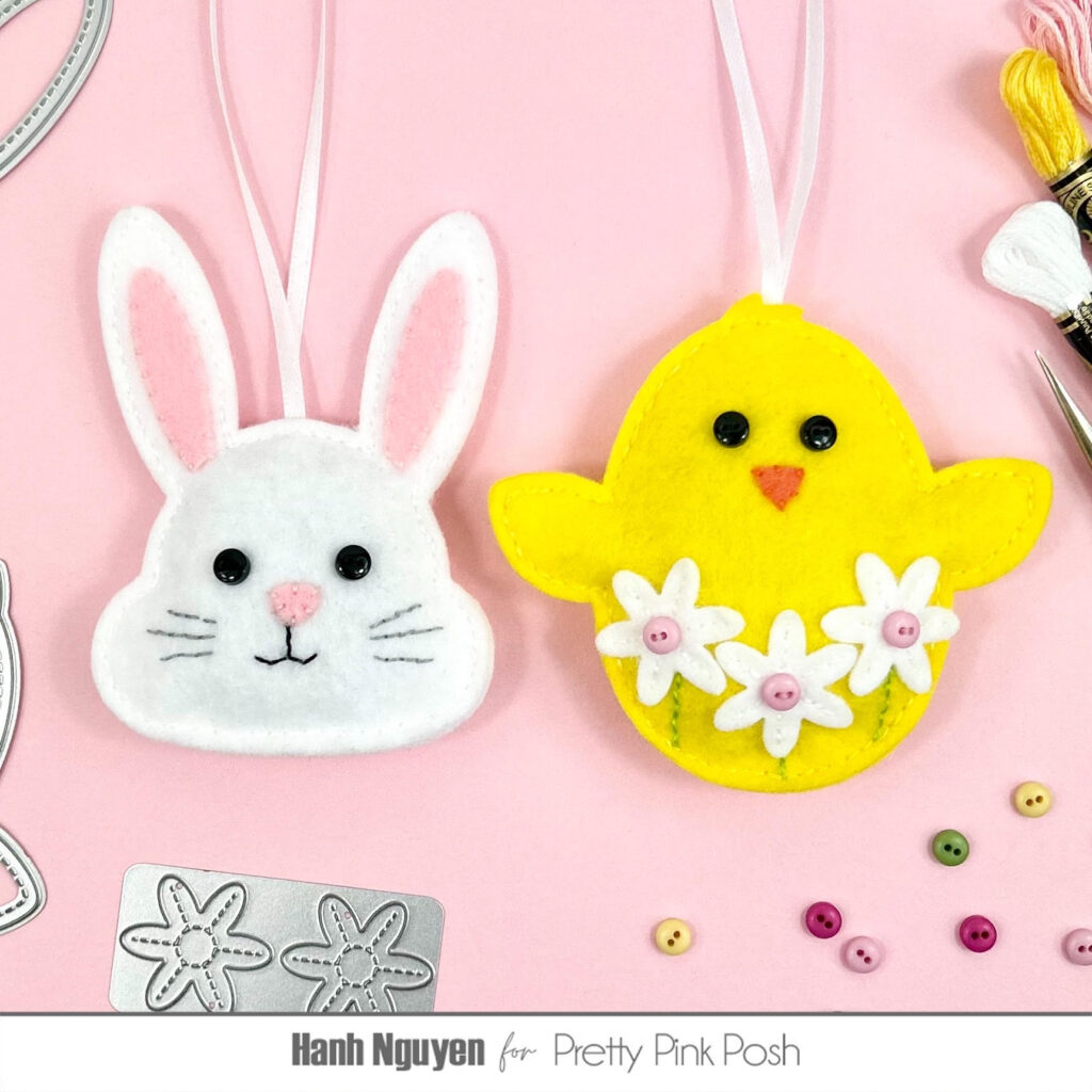
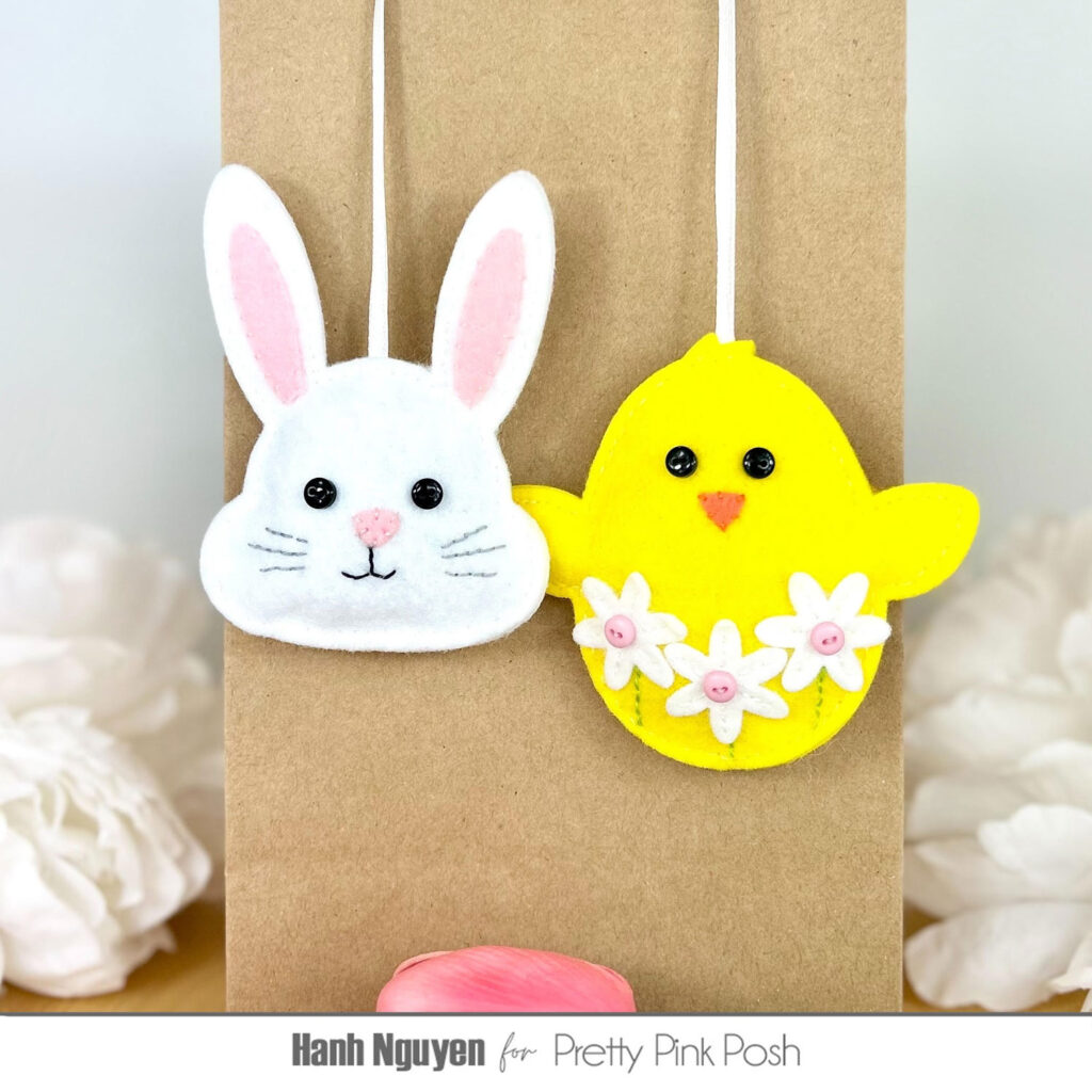
For my two projects today, I used the Bunny Face Shaker Dies and Chick Shaker Dies and decorated with flowers from the Stitched Spring Flowers Dies. These made perfect Easter ornaments but they can also be used as gift bag tags and present toppers. So let’s get started.
For the bunny, I used the Bunny Face Shaker Dies to diecut the outter shape twice out of white felt. I also diecut the nose and inside of the ears with pink felt. I used matching embroidery floss to attach the nose and inside part of the ears. I attached a pair of tiny black buttons for the eyes. I did some simple running stitches to add the mouth details and the whiskers with black and gray embroidery floss.
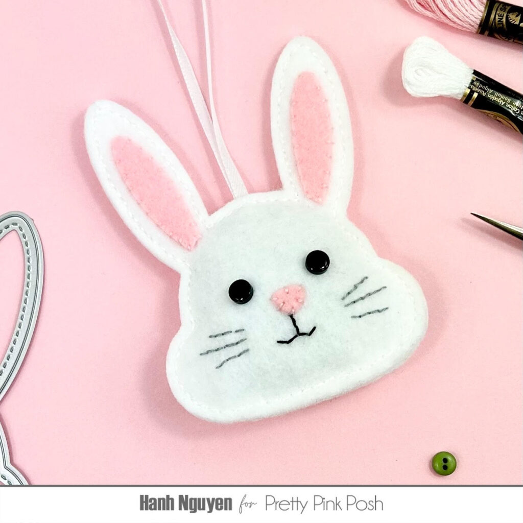
I used a running stitch with white embroidery floss to attach the front and back of the head. The shaker dies are so perfect for these felt projects since the stitched detail from the die left a nice outline on the felt for ease of stitching evenly along the edge. I found it easiest to start the stitching on one of the lower corners of the head then working my way to the ears. NOTE: I chose to create ornaments or tags out of these so I attached a piece of narrow ribbon to the top of the head for hanging. I cut a 10” piece of ribbon, tied the two ends together and tucked the knot in between the two layers of the bunny head and made sure to stitch directly onto the ribbon as I worked my way around the head. When I arrived down at the opposite lower corner of the head, I stopped and filled the inside of the head with some fiber fill stuffing material. I found it useful to use a chopstick or knitting needle to push a small amount of the stuffing into the ears. I continued the stitching and closed off the hole.
For my second project, I used the Chick Shaker Dies to diecut the outter shape of the chick out of yellow felt. I diecut the beak out of orange felt. I felt more comfortable after successfully making the bunny so I decided to step it up a bit and decorate the front of the chick with some flowers that I diecut using the Stitched Spring Flowers Dies.
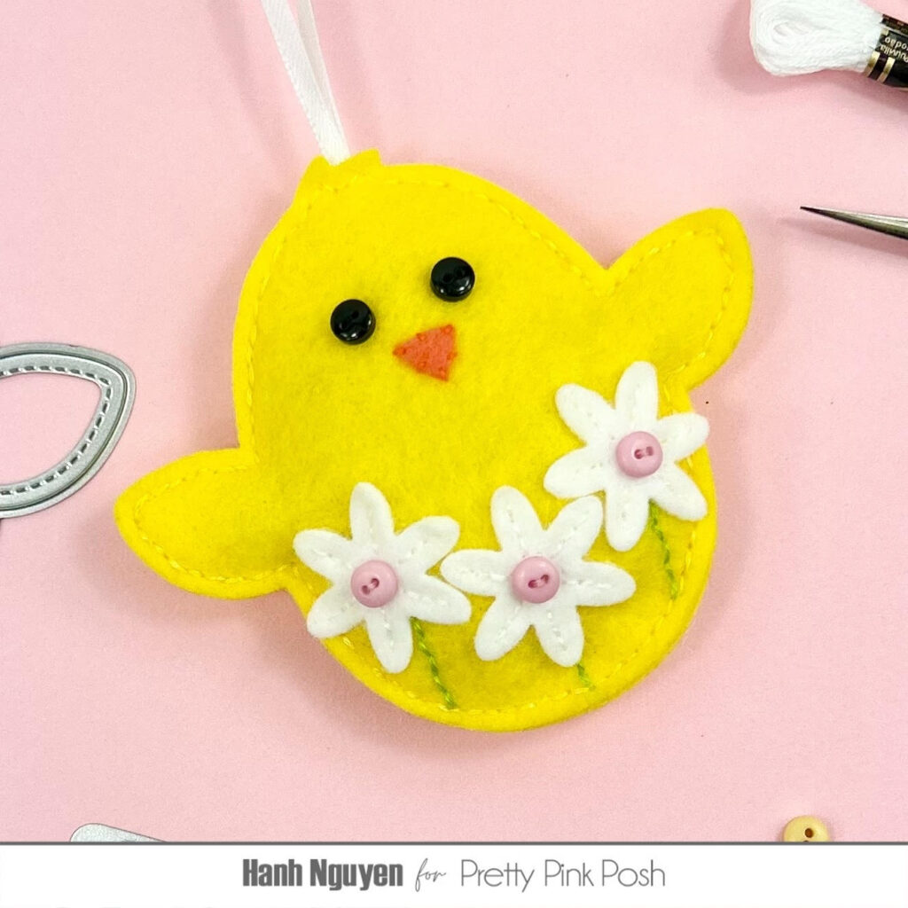
Once again, I used a running stitch and matching embroidery floss to attach the button eyes, beak and flowers. Tiny buttons were used for flower centers. I added some simple stitching with a green embroidery floss to ground the flowers with some stems.
Finally, I attached the back to the from in the same manner as I did with the bunny.
I appreciate you taking the time to stop by and visit today. I hope you liked my felt projects and are inspired to make some felt crafts of your own using these paper crafting dies.
Have a wonderful and crafty day!