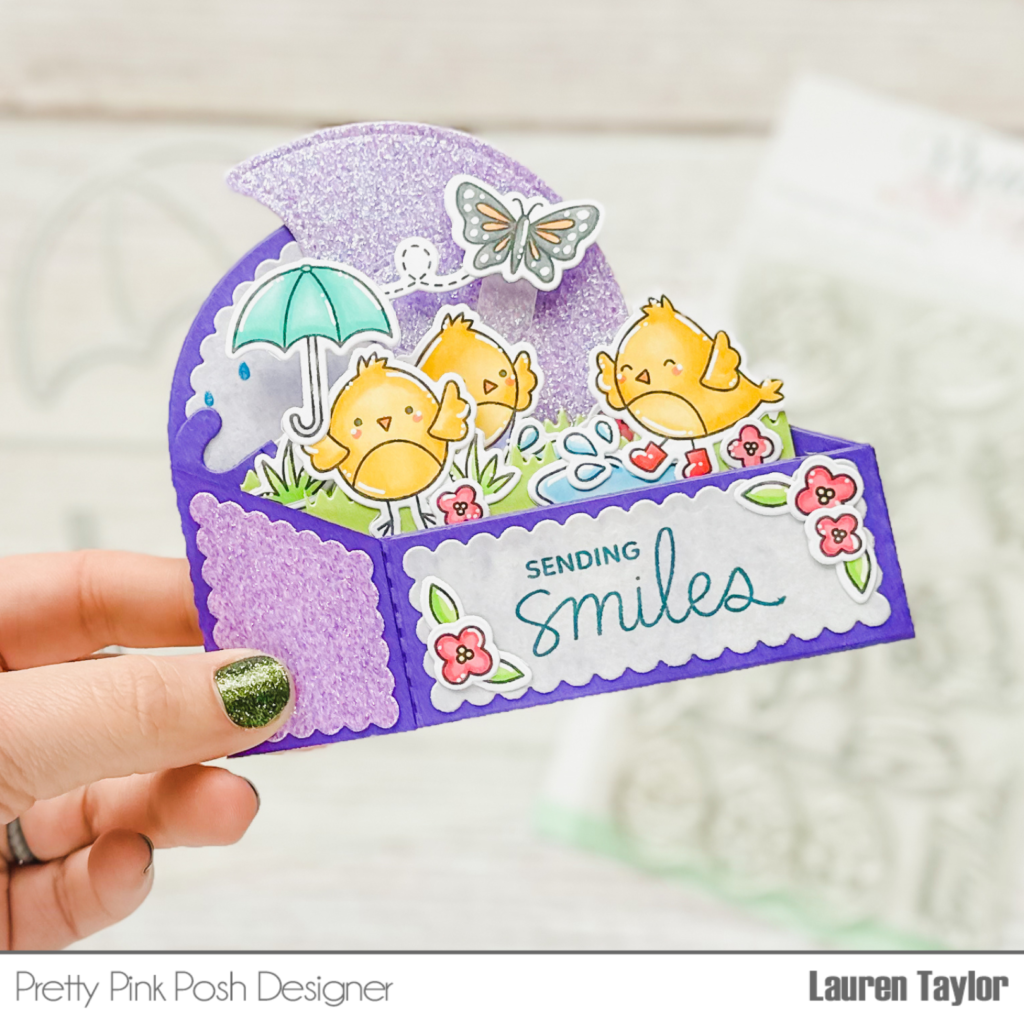
Hi there, it’s Raquel again. For my projeccts today, I’m featuring the Spring Circles stamp set. This set is so fun and versatile.
For my first project, I made a shaker card sized 8″ x 3″. I die cut three circles in this panel using the circle coordinating dies and added my colored images using copic markers in blues, pinks, teals and green shades. I placed these cuties behind the cut out circles and again used the Sparkling Clear sequins as the shaker elements. The sentiment is from the Simple Sentiments stamp set.
The Spring Circles stamp set is so fun that I made another card. Using the Pretty Petals Stencil, I ink blended part of an A2 panel using Seedless Preserves Oxide Ink. For my images I chose Copic markers that matched that ink: RV69, RV66, RV63, RV00 and RV000 and foam mounted them onto the front panel.
Thank you for stopping by, I hope you enjoy today’s projects.
Hello, it’s Raquel. I’m so happy to be collaborating with the folks from Pretty Pink Posh to celebrate their May release. I’ve been playing with some of their new products and I had a blast, they are much fun!
My first project features the Tulip Cover Plate die. This is an awesome die since it allows you to create a full A2 panel using multiple techniques. I don’t know about you but I love colorful strips so this is what I made. I covered a complete A2 card panel creating a gradient color and then run it through my good old Big Shot with this Tulip Cover Plate. For this card I only used some of the cut out pieces and kept the inner parts aside for a future project. I decided to turn it into a shaker just adding some embossing powders to create a contrast between the colors and the white space.
For my second project I also made a shaker card. This time I colored the petals with Copic Markers (R81,R83,R85 – RV55,RV52,RV00- Y11,Y13,Y15) using flicking strokes.
I ink blended the center of my card base using Tumbled Glass Oxide Distress ink and added some Sparkling Clear sequins. I do love the contrast between the pink and yellow tulips and the blue background!
I hope you liked my projects and that they inspired you to create…
Hello everyone! This is Yana Smakula, thank you for joining me! Today I have a slimline card to share featuring gorgeous daffodils, just in time for Spring!
Here is a video so you can see how everything came together.
I am using the Daffodil stencil. This stencil can be used alone, by itself, but it can also be combined with 2 other products for easy coloring. The stencil coordinates perfectly well with the Daffodil stamp set, and it also coordinates with the Daffodil coordinating dies, so you can combine all 3 to quickly create, color, and cut beautiful images for your cards.
I started to work on my card by ink blending the images in Distress Oxide inks onto Neenah Solar White 80lb cardstock. I picked several colors of distress oxide inks – Squeezed Lemonade, Mustard Seed and Wild Honey to ink blend the flowers.
I started with the Squeezed Lemonade as my base color. Next, I added a bit of Mustard Seed to add shading to the petals and a bit of Wild Honey to the flower centers.
I prefer to work with these products by doing the ink blending first, do my stamping 2nd and die cut the images out 3rd. The reason behind it is I like to offset the stamping over the ink blending and I like to use Versafine Onyx Black ink for my stamping and if I ink blend over it, the oxide inks dull and mute the black a bit. So I prefer to ink blend, stamp, die-cut. You can also stamps, ink blend, and die-cut.
When ink blending the flower centers I tried to ink up just the edge of my blending tool and use just that edge to apply color. I love how easy it is and how simple it is to add color to these images using the stencil – you don’t have to think much, and it doesn’t take a lot of time. You can make a bunch of daffodils in no time.
With my ink blending done, I placed the panel inside my mini misti tool and stamped the image outlines in black. Next, I cut these images out using coordinating dies.
I knew I would need to add a touch of purple to my card, I love to combine yellow with purple, so I used my Crocus stamp set to stamp and color a few images. I used Copic markers in YG17, YG03, and YG01 markers to color the grass; BV11, BV00, and BV000 markers to color the flowers. These also have coordinating dies and so I cut them out.
I wanted to include as many daffodils on my card as I could, and for that, I knew I’d need to make a bigger card, so I opted for a slimline one. I cut a white cardstock panel to 3 ⅛” x 8 1/8” to make a background.
From here, I foam mounted the images onto the panel – I already had a plan in mind, I wanted to add a daffodil or a cluster of daffodils and add one crocus to add some purple color. I also added the leaves and the grass pieces to build my background.
I foam-mounted all of the pieces as I like to have dimension on my card. Next, I used my scissors and trimmed the excess off. To create a sentiment I stamped one that reads Sending You Smiles Across the Miles, it comes from the Encouraging Greetings stamp set and cut it out to a circle using a die. I foam mounted it onto the card. I also foam-mounted the background panel onto a slimline card base. The card base measures 3 1/2 x 8 1/2”.
Hello, Gemma here for a new Clean and Simple post. Today I’m using the new Flower Bouquets stamp set from the May release on my card today. These beautiful floral arrangements make it so easy to create simple but pretty CAS cards.
I stamped one of the images from the Flower Bouquets stamp set and coloured it with copic markers. These are the colours I used:
BG72, YG61
G07
G40, G43, G24
BV00, BV02, BV04
R81, R83, R85
N0, N1
Y11, Y13, Y15
YR02
In addition, I stamped some butterflies from the previously released Mom stamp set. I used the following copic colours:
YR000, YR02
B000, B00, B34
V01, V12, V15
After die cutting the images with the coordinating dies, I added some extra layers for dimension.
I thought the watering can would look fun with a pattern. Using the new Mini Polka Dots stencil, I inked through the stencil with clear embossing ink, then heat embossed the pattern with gold embossing powder. I used some simple masking with washi tape so I only inked the area of the watering can that I wanted the pattern on.
On my A2 card base, I stamped the sentiment from the Flower Bouquets stamp set. To help ground my floral image, I cut a piece of patterned paper to adhere to the card base. Finally, I added my flower bouquet and butterflies to finish my card.
Hi crafty friends! It’s Mona here, today I am sharing with you a new video tutorial where I am showing you how I colored these birds and florals with some shaker card tips as well.
I stamped the images with alcohol friendly inkpad and colored the images with Spectrum Noir Illustrator Markers. If you got inspired, check back here to see this coloring guide.
I have used other colors too: BT4, BT3, BT2, BT1, AG2, AG1, CG2, CG1, OR1, BO1, CT4, CT3, CT1, GY3, PL2, HB3, HB2, HB1, PV1, MG2, MG1, BP1, PP2, PP1 and the colorless Blender. You can watch the coloring processes with useful tips in the video. After the coloring I added white highlights with white pen and pencil.
The next step was the sentiment. I stamped the sentiments from the Happy Mail and the Everyday Greetingsstamp sets with watermark ink to the vellum and heat embossed it with white detailed embossing powder.
The following step was to create the shaker parts. First, I have created teal and pink die-cuts with the largest die from the Slimline Peekaboo Windowsdie set, as well as two white scalloped frames for each card with the Slimline Scallop Frames. I have also cut two pieces of vellum in the same size.
Then I put the card together with a trick using the Original MISTI. If you are interested in this trick, just click on the video.
When my shaker was done, I adhered the colored images to their right place, and adhered it to the card base. Thank you so much for stopping by, see you next time.
Hello there! I wanted to pop in quickly to announce the three lucky winners of the Product Release Blog Hop posts HERE, HERE and HERE. Here are the lucky winners…
Winners, email me within 7 days and I’ll send over the gift certificates so you can shop!
Thank you to all who hopped along in this blog hop. If you joined along in our Instagram hop, we’ll be posting those winners shortly on our account there!
Hey craft friends, Elaine on the Pretty Pink Posh blog today sharing a sweet colorful appreciation card featuring the new Spring Circles stamps.
To start I cut a piece of pink card stock to 6”x 6.5” and scored at 3.25” on the longest edge. Using a bone folder, I burnished along the fold line to create a card base that measured 6”x3.25”.
To add some detail on the front panel I used the Mini Polka Dots stencil and lightly blended on some Distress Ink in Wilted Violet. Due to the size of the card base I had to stencil in two sections. This was easily done by lining up the dots to create a seamless pattern.
Setting the card base aside, I began to work on the base for the circle images. I cut a piece of white card stock to 6”x2.75” and used one of the Scallop Border dies to create a scalloped edge on both long sides. Again, I used the Wilted Violet Distress Ink to lightly blend on some colour to the edges on the panel. I then adhered this panel to the card base, ensuring it was placed so that there was room for a sentiment below.
I stamped the circle images on to copic friendly cardstock and used a variety of markers to color each of them. The markers I used were:
Pink 1: RV66, RV63, RV10
Pink 2: RV14, RV13, RV11
Blue: B66, B63, B60
Purple: V15, V12, V01
Green 1: G07, G05, G02
Teal: BG15. BG13, BG11
Yellow: Y15, Y13, Y11
Black: C7, C5, C3
Blue: B01, B000
I cut out masks for all the images and used them to cover the images before applying a light layer of Distress Ink in Tumbled Glass. I used small blending brush to help my concentrate the color in the centre of the circle and gently pulled the color out to give a soft blend from blue in the centre slowly fading out to white. I used the Spring Circles coordinating die to cut out the images and then adhered them to the card.
The sentiment was taken from Mom stamp set, and white heat embossed on to black card stock. I trimmed this out using a guillotine trimmer and adhered to the front of the card.
To add some sparkle, I used liquid adhesive to secure some Sparkling Clear Confetti around the card front and added some Lemon Jewels to the centres of the flowers.
For the last touch I added some Wink of Stella on all the coloured images and coated some of the elements with Glossy Accents; I love the raised shiny look.
Thank you for joining me today, I cannot wait to see what everyone else creates with this beautiful stamp set!
Hello, crafty friends. It’s Leica here and I have a circle shaped card to share with you all, featuring stamps and coordinating dies from the May release. For this card, I used the new Nautical stamp set. Let’s begin.
Next, I stamped, colored, and cut the images from Nautical stamp set. I squealed out loud when I saw the coordinating die for the Life’s An Adventure sentiment! I love that Paulina included that for this wonderful set and I hope we see more coordinating dies for sentiments – teehee!
To finish the card, I white heat embossed the waves onto the blue panel and then adhered the stamped images down. I then adhered the inked panel onto the white circle. To make the card base, I die cut another 4.5″ circle in white cardstock, scored at the .25″ mark and glued that to the panel.
That’s all for this shaped card. I hope you like my take on this Nautical Stamp Set and that I have inspired you to create with it.
Let’s start with the circle card. To begin, I die cut a white cardstock using a 4.5″ circle die and another one in 4″. I then ink blended the smaller circle with Tattered Rose Distress Oxide ink and sprayed some water for some interest. I also cut a small part of the circle in white cardstock for the grass area and inked with Twisted Citron Distress Oxide. The scallop edge is cut using Scallop Borders Dies. I ended up with 2 layers of the grass area, because the inked smudged on the first layer so I fixed my mistake by adhering another layer on top. In the end, I liked the look of the double scallop edging for the grass.
Next, I stamped, colored, and cut the images from the Bee Friends stamp set. I then stamped the bee trails on the circle panel and the sentiment on the grass piece. Lastly, I adhered the stamped images onto the card panel using liquid glue and the bees with foam tape for dimension.
Hey crafty friends, Elaine here for Day 2 of our blog hop. I’m sharing a seaside themed card with the amazing new stamp set Nautical. To help build the cute scene I also used some other Pretty Pink Posh goodies and I have them linked throughout the post.
Firstly, I stamped out my images and coloured them with copic markers. The numbers I used were:
Red: R59, R39, R29
Blue: B99, B97, B95
White/Grey: C3, C1, C00, 0 (blender)
Yellow: Y15, Y13, Y11
I then went ahead and cut out the images with the Nautical coordinating dies and set them aside while I worked on the circle scene element of the card.
To create the layered circle scene, I cut 4 circles from heavyweight white card using the largest circle die in the Lets Partydie set. One of the circles I left whole and blended on some Distress Ink in Tumbled Glass for the sky. This created the base layer. The next layer I freehand cut a shape to represent ‘land’ or a ‘bank’ for the lighthouse to sit on. I used Distress ink in Vintage Photo for the land layer. For the wavey layers (there are 2) I used the small scallop border die from the Stitched Borders 4 die set to create waves. Both layers were ink blended with Distress Ink in Faded Jeans. I adhered all the layers together with liquid adhesive. To give the waves a little more interest and definition I used a white paint pen (you could use white acrylic paint or white gouache on a paintbrush) all along the top edge of the waves to help them stand out and give the look of sea foam or waves breaking. Before stamping on the birds, I gently laid my boat and lighthouse on to the scene to give me an idea of where the birds needed to go. Once stamped with a black ink I filled them in with a black copic marker (100). I adhered the lighthouse and boat to the scene and left to fully dry.
As a base for my coastal scene, I cut a piece of navy card stock to 4.25” x 4.25” and layered that on top of a piece of stripy patterned paper which measured 4.5” x 4.5”. The two layers were adhered together with liquid adhesive and then secured to a white square card base measuring 5” x 5”.
For the sentiment I stamped out the ‘Life’s an Adventure’ sentiment with a navy ink on white card and cut out with the coordinating die. The circle scene and the sentiment were then adhered to the front of the card. Lastly, to finish off the card, I popped a few white clay confetti hearts here and there and I love how they pop on the dark navy background.
PRIZES: be sure to leave comments on each stop. We are giving away 3 $25 gift certificates to three random comments (1 winner each day) left before May 9, 2021 at 11:59 PM PST. I’ll be announcing the winners next week, so be sure to return and see if you are one of the winners!