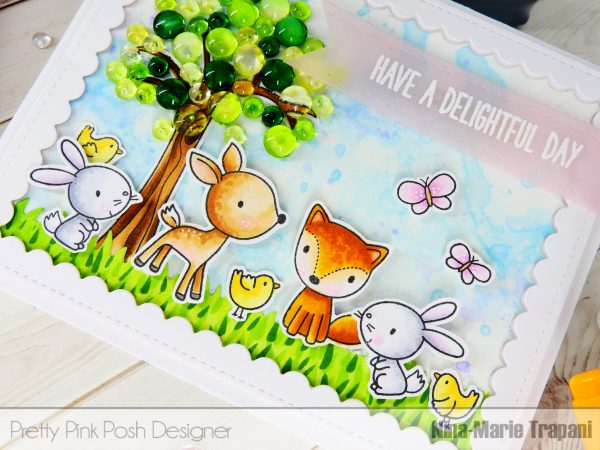
Distress Ink Halloween Card + Video

Hello, Pretty Pink Posh fans! This is Yana and I have a video tutorial to share today featuring one of the new stamps & coordinating dies – Halloween Friends.
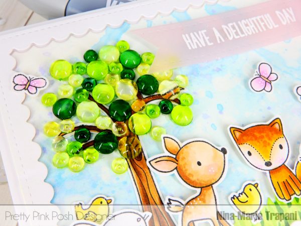
I’m also going to share a simpler and faster way to create ink blended backgrounds and will talk a bit about ghost stamping! I filmed a video tutorial to walk you through the process from start to finish and explain everything in detail.

By the way, you’ll still be able to add water to your backgrounds, done on colored cardstock, to have Distress inks move and react like they usually do on white, and it will take you significantly less time (and ink!) to blend a background. It took me a little over 3 minutes to create a background for this card (while it usually takes no less than 10 minutes if I start on white).
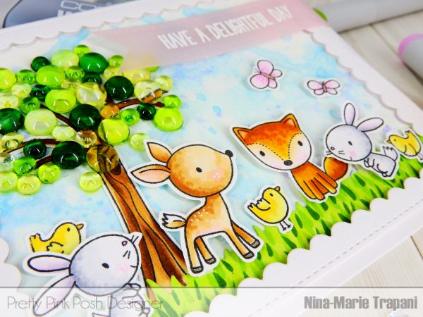
Another trick I am sharing today is cutting critter silhouette out of black cardstock to use a shadow or create the illusion of having multiple critters on a card. This doesn’t work everytime and on every card, but it does look fantastic on those cards where the background is dark.

The last tip for today is to try using watermark embossing ink over the ink blended background to create ghost stamped images. Stamping with this kind of ink will create slightly darker transparent impressions that look like shadows or ghosts!


- Halloween Friends stamp set
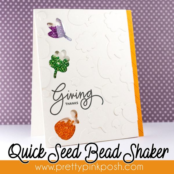
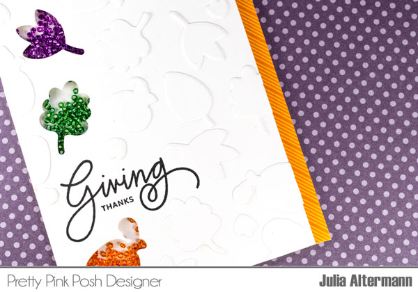
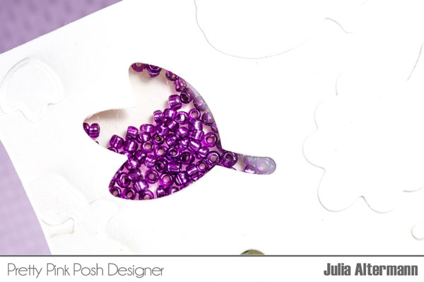
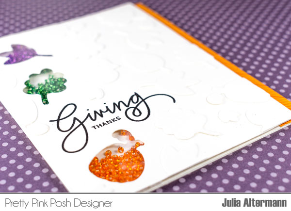
- Giving Thanks stamp set
- Versamark: Amazon // Ellen Hutson // Simon Says Stamp
- Heat Tool: Amazon // Ellen Hutson // Simon Says Stamp
- Copic Markers: Amazon // Ellen Hutson // Simon Says Stamp
I hope you’ve enjoyed this card and video!