Clean and Simple Fall Cards
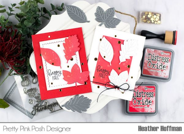
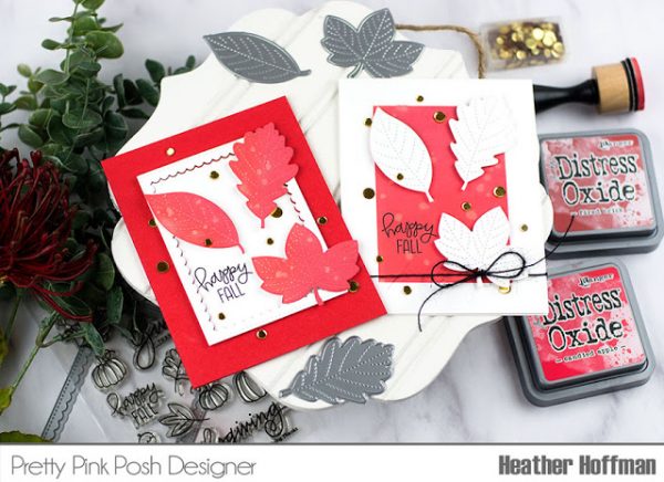
Even though I used the same layout, I love that these have a totally different feel just by switching which elements are white and which are colored! And there is lots of fun dimension thanks to foam adhesive, and of course, some pretty sparkle from the fun Metallic Gold Confetti Mix!
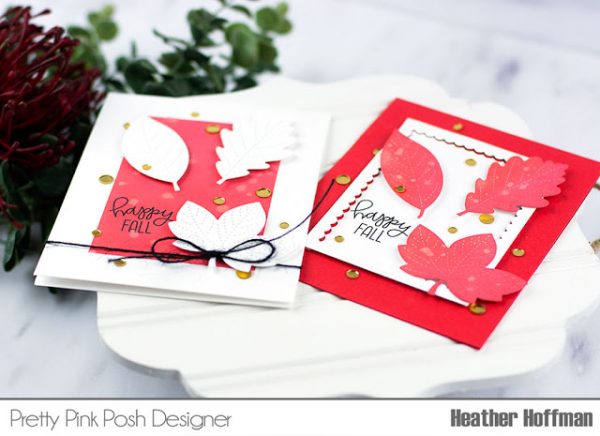
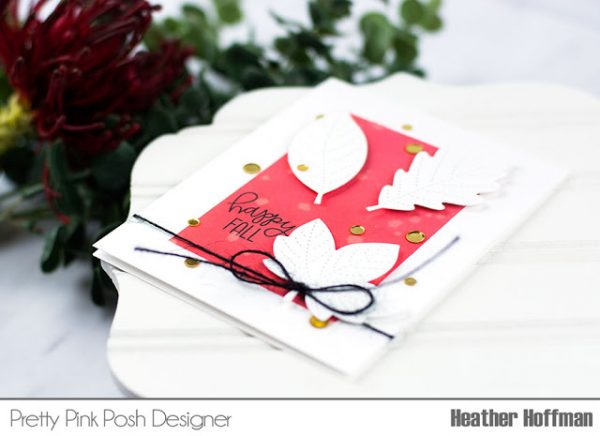
For the first card, I used a white cardbase, masked off the sides of the card with easily removable Post It Tape, and blended two colors of Distress Oxide ink (Candied Apple and Fired Brick) on the panel. I added a few splatters of water, removed the masking tape, then stamped my sentiment from one of last years releases, Giving Thanks.
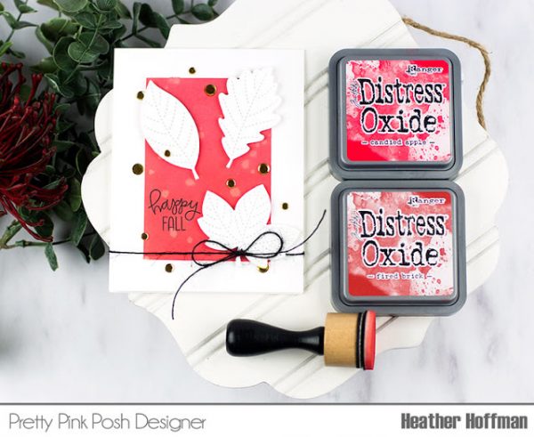
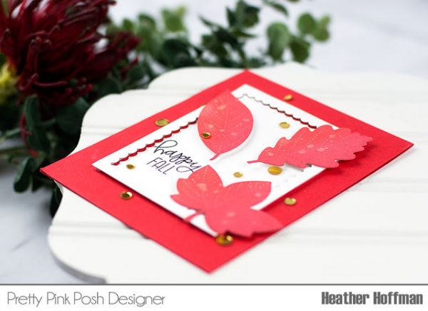
For the second card, I started off with a colored cardbase, then die cut a piece of white cardstock using the smaller rectangle from Scallop Frames Dies. I then blended the same two Distress Oxide inks on the leaves and added some splatters of water.
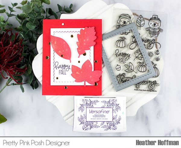
I adhered the outer edge of the frame with thin strips of foam adhesive, then stamped my sentiment and adhered the center of the frame inside and directly on the card base. Added the leaves with foam adhesive as well, and also a sprinkling of the Metallic Gold Confetti Mix on this one.
I’m so excited that Paulina has released more of the Confetti mixes! They are such a fun way to add sparkle to cards!
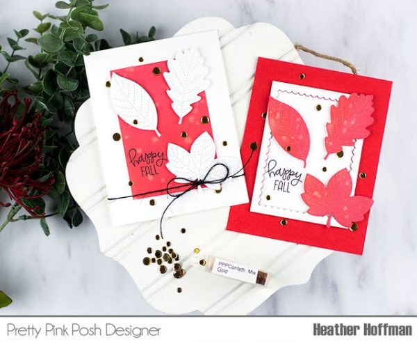
Would love to hear what you think – which is your favorite? Softer with more white space, or bold and full of color?
Beautiful cards :)
Hi, Love these..They are so cool! I love them both but if I had to pick my favorite I have to say I am a Bold and full of color kind of girl. Awesome job and thanks for sharing.
Both cards are beautiful! I love those leaves. I also like how you framed the leaves. I wouldn’t have thought to do this but I love it! I will say that my favourite of the the 2 is the bold one!
This is a great duo of cards and they’re so different, it’s hard to pick one. I really love them both.
These cards are awesome. I love the colors and reverse colors. Great using the leaves.