Autumn Theme Week: Day 7
**All items in the Fall section are 15% off during theme week**
Hello crafty friends! It’s Lisa Mears on the blog today and I’m excited to share my latest cards with you! I made two grid cards that feature the beautiful Fall Icons stamp and dies from Pretty Pink Posh!
Watch the video above I Watch the video in HD on YouTube
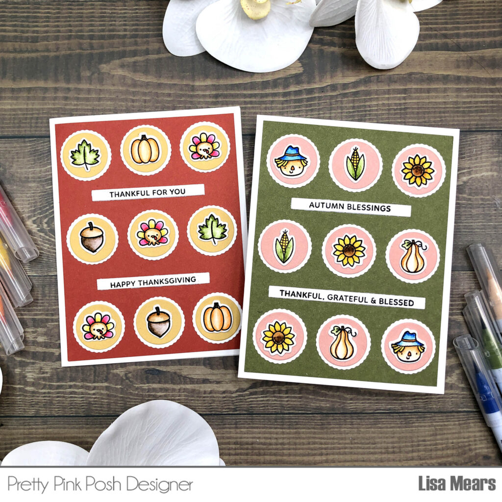
Grid cards are all about structured elegance. By arranging your elements in a grid pattern, you create a clean, organized look that draws the eye to each individual piece. This layout is perfect for showcasing a variety of stamps, dies, or embellishments, and it makes for a cohesive, balanced design.
The grid design has a lot of versatility. You can use stamps, dies, or a mix of both to feature multiple elements without overwhelming the card. It’s a great way to highlight different designs or colors in a unified way.
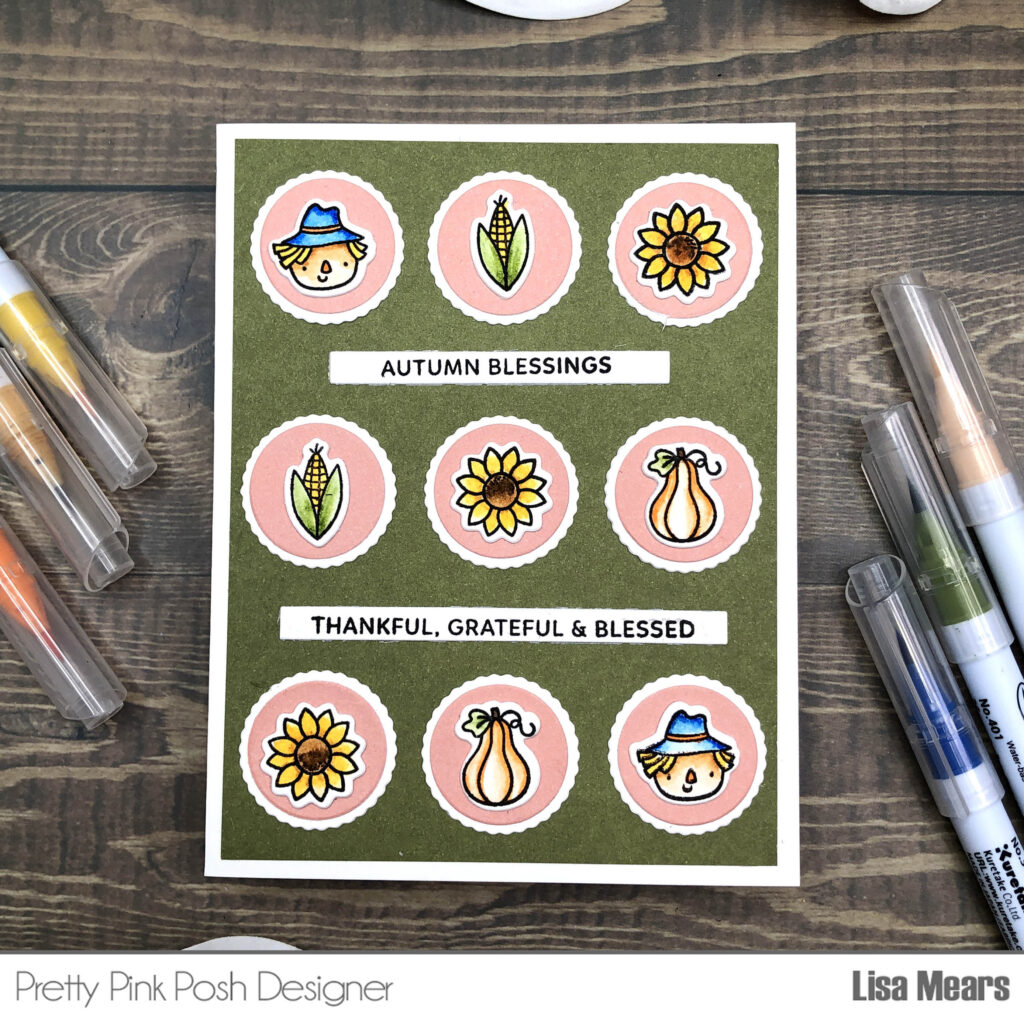
When designing a grid, first decide on the type of layout you want. I went with a 3 x 3 layout for a balanced look. This simply means that my card has 3 rows and 3 columns.
Next, select your stamps or dies. For my cards, I used the Fall Icons stamp and coordinating dies. This stamp set has 12 different fall-themed icons such as a pumpkin, scarecrow, fall leaf, acorn, and more.
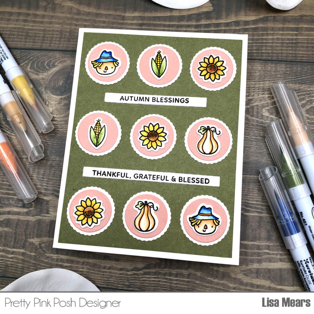
I colored my stamps with Zig Clean Color Real Brush markers. The markers I used were: Mustard, Mid Brown, Pale Orange, Marigold, Beige, True Blue, Mimosa, Evergreen, Carmine Red, and the Blender. After coloring, I die cut the stamped images with the coordinating dies.
I also used the coordinating dies and die cut the scalloped circle dies from white cardstock and I die cut the circle dies from colored cardstock. I adhered the circles to the scallop circles. Next, I added the fall icons to the top.
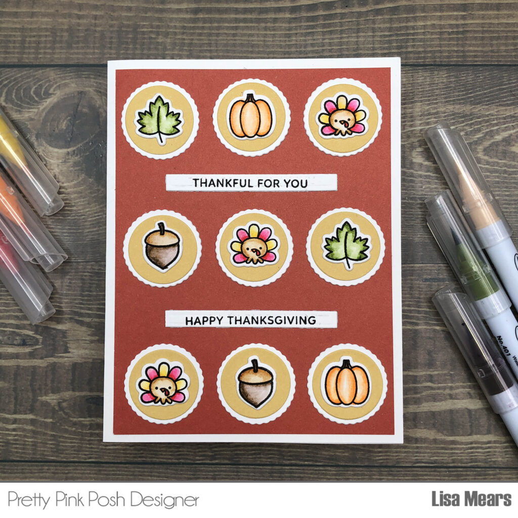
I adhered the circles to a piece of colored cardstock that measures 4″ x 5 1/4″. I started with the center circle and then adhered the remaining circles in the middle row. Then I adhered the top and bottom rows until all of the circles were glued to the cardstock.
Next, I stamped two sentiments from the Sentiment Strips: Fall stamp set. I die cut the sentiments with the coordinating dies and added them between the rows. I adhered the panel to an A2 size card base.
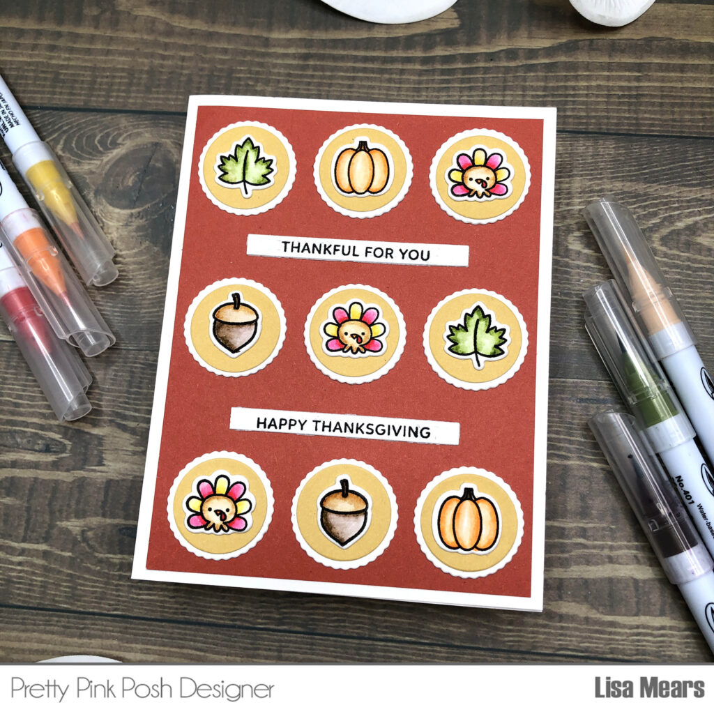
Using this grid technique is a great way to create a card that’s both organized and visually appealing. It’s perfect for showcasing a variety of elements while maintaining a clean, structured look. I hope you enjoyed this step-by-step tutorial and that you’re inspired to try this technique with your own stamps and dies.
Happy crafting!
Lisa Mears

Great work, Lisa!!
Saw the video for this card too! Love the little images :-)