Tutorial: Batik Background Stamping
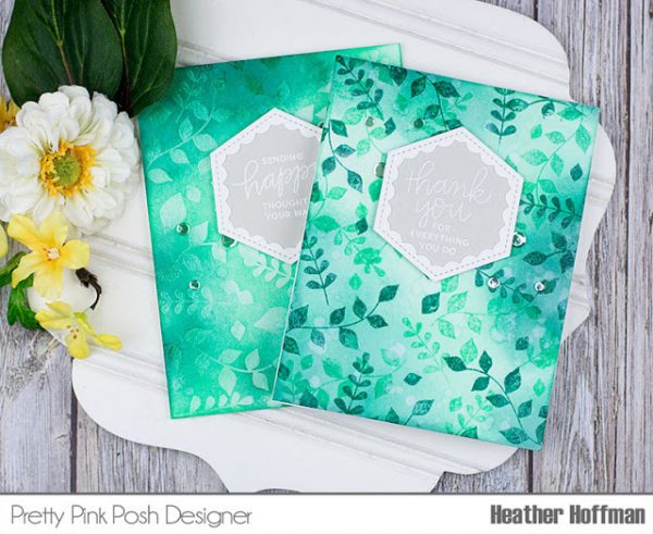
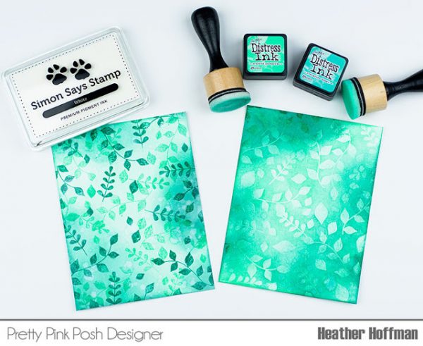
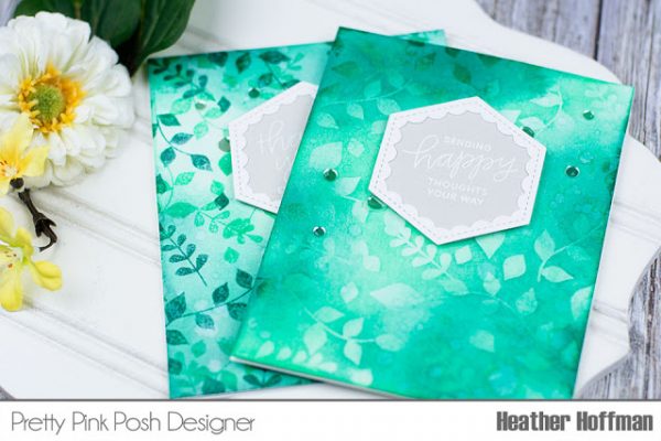
Good morning! Heather here to share a tutorial on these two cards on which I attempted to create a background for my card similar to a Batik fabric (if you have no idea what that is, click HERE or HERE to see a couple examples, or do a quick search on Pinterest!) The two different methods I tried gave me two slightly different results – one a bolder look, and one a softer effect. I can’t decide which one I like better!
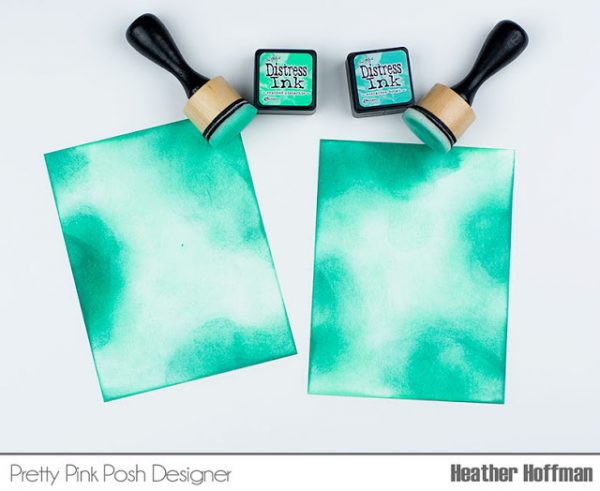
I started off by picking two shades of distress ink, and applying it to my backgrounds – first the lighter shade, then the darker. I purposely went fairly random in my patterns going for an “imperfect” look intentionally.
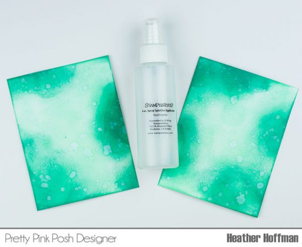
Next, I added some flicks of water to react with the distress ink for more texture. At this point I heat set the entire panel. IMPORTANT: You want it to be NICE and dry after this step – so either give it lots of time to dry or zap it good with a heat gun!
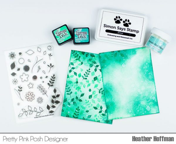
Now to add the leaf images to the background. I picked several of the solid images from the new Build a Bloom stamp set – including some of the single little leaves to fill in the holes. The softer one on the right I stamped with Clear Embossing ink and heat embossed with Clear Embossing Powder. The bolder one on the left I stamped with both shades of the same distress ink I used on the background, deliberately layering and overlapping the leaves on that one. I then quickly sprinkled on some embossing powder on that one so it stuck to the newly stamped leaves. The distress ink stays wet long enough to do that if you work quickly. THIS is why you wanted those backgrounds thoroughly dry so that the embossing powder doesn’t stick anywhere that you don’t want it too!
Finally, I applied some more distress ink to the softer colored one – the way the colors overlap it gives two tones of color the the card exactly like I was hoping! On the darker bolder card, I applied a little white pigment ink on some spots to add some more texture and color variation.
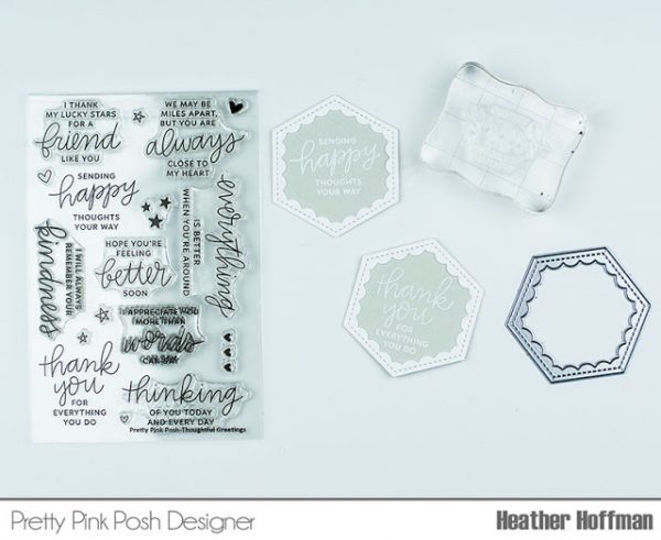
Next I built the sentiment portion using the gorgeous new sentiment kit, Thoughtful Greetings, and the fun new addition to the scallop dies, Scallop Hexagons! The sentiments I heat embossed in white on some soft gray cardstock, and framed them with the white scallop frames.
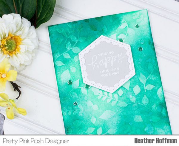
Finished off by mounting those sentiment panels with foam adhesive, then added some Sparkling Clear Confetti Mix. Here is a closer look at the softer one – can you see the shine from the embossing powder?
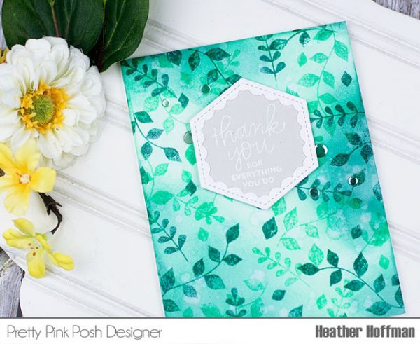
And then here is the bolder one:
This was so much fun to create – and I can imagine so many different color combinations that would be fun too!

love these batik backgrounds – will have to give this a try – looks like fun!
WOW Heather, they are beautiful.
THANKS for the great tutorial! Your cards are gorgeous and you reminded me of some techniques I haven’t used in awhile 😊. Love both looks!
Beautiful blending and love the images. Stunning cards
Gorgeous, thanks for sharing the great technique!
Hi Heather & Paulina ~ As a self-described Distress Ink junkie, I love that you chose to do the batik with some of my favorite inks. The end results are beautiful….well done! ~HUGS~
#kindnessmatters