
Tutorial: Magnolia Butterfly Scene
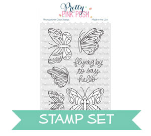
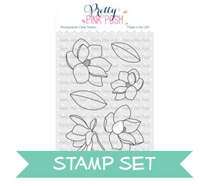
Good morning Pretty Pink Posh fans! Heather here this morning to share a card using a couple of the beautiful new releases from PPP to make this soft and dreamy card! The gorgeous Magnolia Flowers and Beautiful Butterflies stamp sets were just made for each other – don’t you think?

I’ve combined some simple Copic coloring, ink blending, and a bit of sparkle to put this together – keep reading for a photo tutorial of how it came together!
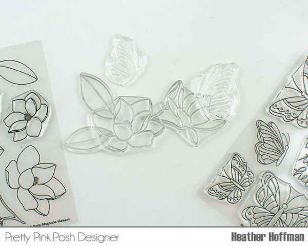
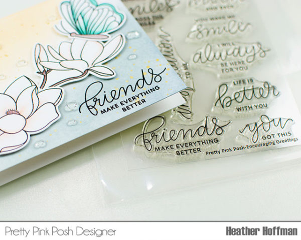
One thing I like to do when building a scene, is lay out the stamp sets to get a visual of how I want them to all come together. Obviously you can’t stamp them like this, but when I like an idea, I often snap a quick photo with my phone so I don’t forget what I had in mind. Sometimes the plan changes a bit, but this really helps me to picture the finished card a bit!
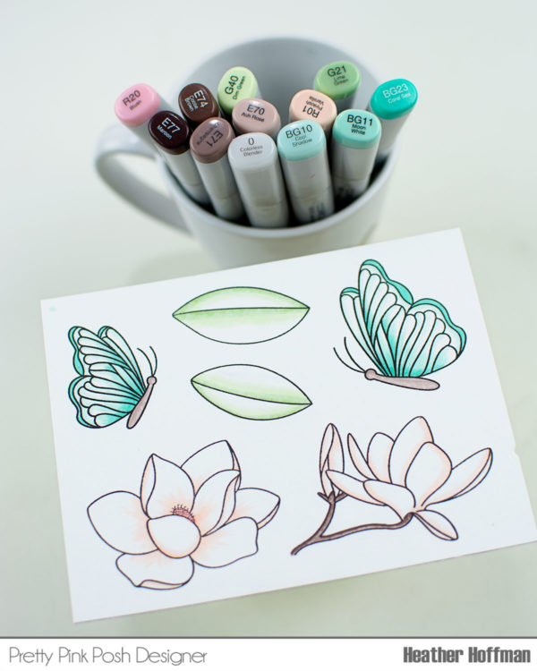
Next, I stamped all the images out, and colored them with Copic markers. I wanted the colors to be nice and soft for this card, so I used my colorless blender a lot! I lot of the areas I added a bit of color, starting with the darkest, blending out with a lighter shade of the same color, then blending that edge out with the colorless blender. This next photo shows the colors I used for these:
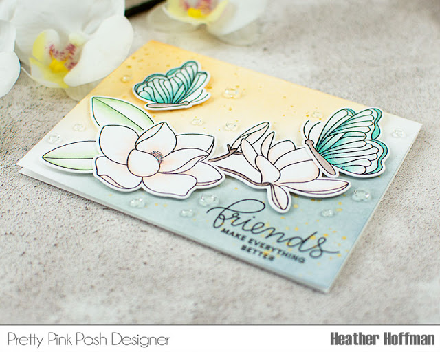
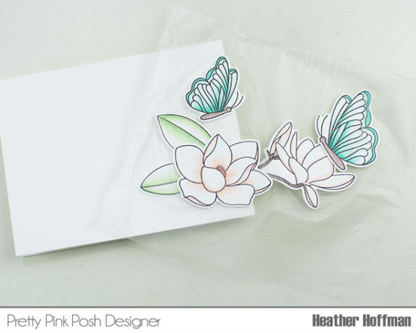
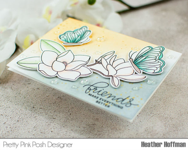
Next, I die cut the images with their coordinating dies- Beautiful Butterflies and Magnolia Flowers – and arranged them on a white card base. I ended up sticking pretty close to my planned layout and was really happy with it! I used a piece of Press-and-Seal (a Jennifer McGuire trick!) and picked up all the images to set aside while I did some ink blending on my card base.
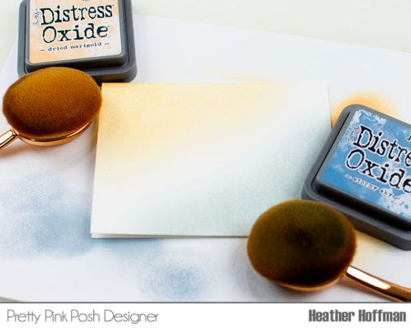
I added the ink in diagonal corners so it would add depth behind each side of the images when I put them back in place. I’ve been enjoying using make-up brushes as ink blenders – they work SOOO easily and fun! And they are fairly inexpensive as well!
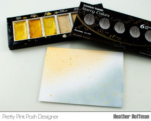
Next, I just had to add a touch more sparkle – so I added some gold splatters using my Starry Colors Palette, and gave it a bit of time to dry.
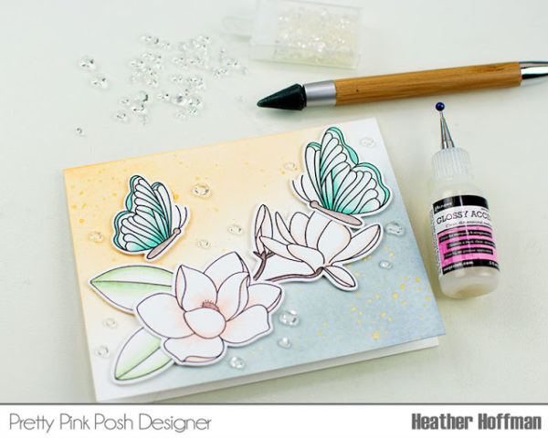
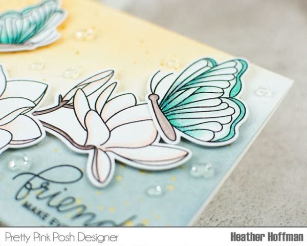
I added foam adhesive to the back of all my images, pressed them into place on my card front, and then peeled away the Press-and-Seal. Perfect placement! Now to add some more sparkle, I pulled out my Sparkling Clear Jewels. Kind of on accident, I discovered that I liked them even better if I glued them in place upside down! Instead of adhering the flat back, adhere the smaller flat portion of the front of them – I felt like it showed off the design of the jewel even better, and made it more sparkly! I like to use Glossy Accents to adhere them on, and my Crystal Katana is also super helpful.
Here on the finished card you can see how those jewels are set in place upside down a little better – do you notice how they are more sparkly that way?
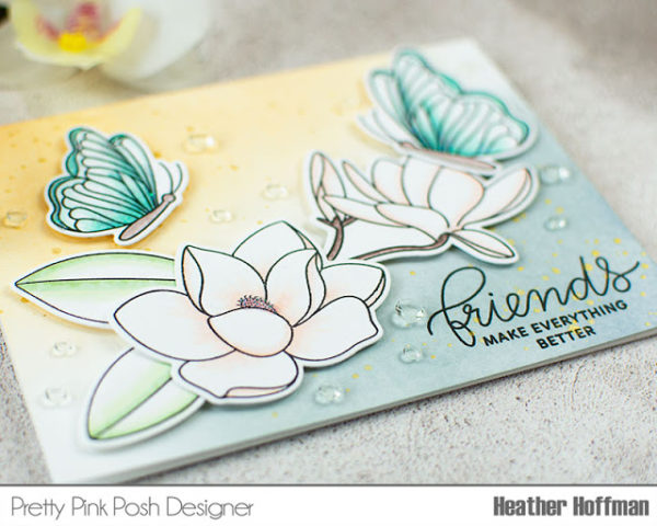
I used my MISTI to stamp a sentiment from Encouraging Greetings– a previously released stamp set, and pretty much a must have! It was the perfect size to fit in the little space I had on the bottom corner there.
And, because you can never have too much sparkle, I added some sparkly clear Blizzard Nuvo Glitter Drops on the butterflies, blending it out from the centers and adding it around the outer edges.
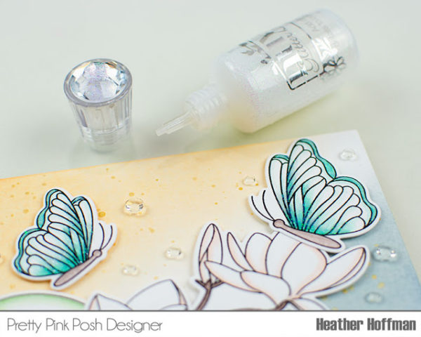
Here is what it looked like when it finished drying.
I love the soft and subtle colors on this – so fun to play with different color combinations!
What is your favorite style of color combination? Soft and subtle, or bold and bright? Or are you like me and love to do both?
Thanks so much for stopping by today – hope you have a wonderful day!
Stunning card! Love the soft colors, but really love how you only blended on the corners which gave that whimsy in the middle. Thank you for sharing your talent and inspiration.
Wow Heather, such a dreamy card! I love your soft pastels, perfect for Spring! The background is perfect to showcase the pretty flowers and butterflies. I’ve just added everything shown to my wishlist! Love, love, love this gorgeous card!
Such a beautiful card with soft coloring!!